Flare Theme Builder
Flare Theme Builder
V1.0.0
M2 “Flare Theme Builder” of AppJetty helps organizations of all sizes build eCommerce websites with custom storefronts for their online printing business. It is easy-to-use and technologically advanced.
After integration in the Magento backend side, You will get the THEME FLARE tab menu. From here you can design your store and enhance your eCommerce and Printing business.
There are three different themes are provided under THEME FLARE: General, Cards & Apparel.
")

Theme Installer
You can import the Magento data to the Theme FLARE if you want. For that navigate to the Theme FLARE -> Theme Installer.
By clicking on the Import button, you can import all the preloaded data like predefined slider, brands, blogs, blocks, and testimonials for the Theme FLARE.

Manage Themes
Navigate to THEME FLARE ⇒ Manage Theme and the Theme design configuration page will get open. It contains a grid with the available configuration scopes. To configure the design settings, click on the ‘Edit’ option of the relevant Store.
Under the Manage Themes, you can configure the store-specific theme individually. To configure the design settings, click on the ‘Edit’ option of the relevant Store.
Default Theme
Applied Theme: Select the Applied Theme for the new theme. Here you can change it to any of the installed ones.
User Agent Rules:
– Click Add New User Agent Rule under Design Rules.
– From the ‘Search String’ column, enter the browser ID for that particular device.
– From the ‘Theme Name’ column, select the theme used for that particular device.
– Continue the process until entering the adding device.
– Perl Compatible Regular Expression (PCRE) or searching string to match when entering new themes.
-> Under Other Settings, expand each section:
– HTML Head
– Header
– Footer
– Search Engine Robots
– Pagination
– Product Image Watermarks
– Transactional Emails
Please follow the instructions in the linked topics to edit the settings as required.
After inserting all the necessary details, click on the Save Configuration button.
Now, you can add and manage the CMS page and select the New Theme in it.


Manage Theme Options
There are three themes that are provided: Apparel, General & Card. Select the theme to load the predefined template for the selected store.
You need to select the Store for which you want to apply the theme. By switching the Store, the “activated theme” can be seen for the selected Store. By moving the mouse cursor, the “Apply” button will appear. Click on the Apply button to activate that Theme for the specific store.
Once you click on the Apply button, the popup alert message will appear to confirm changing the theme with default layouts for the selected store.
If you select No, the previous layouts will not get changed. But if you select Yes, the previous layout values will get changed to the default layout values of the theme.
Now you can add and manage the pages (Home/CMS) and select the New Theme in it.


General Configuration
Under the “General Configuration”, you can add a new page or edit the existing page. You can configure the Web Page design as per the details you want to show on your web store and select the relevant theme for the Pages (Home/CMS).
After managing the pages, you can configure the Color Variables for the effects, Font Variable, and Button Style.

Manage Pages
From the backend, you can create a new page with details like multiple images, blocks, variables, and widgets. All of them are design-friendly for search engines that crawl the metadata of the page so that people can find you easily.
Enable Page: You can enable/disable the Page as per requirement.
Page Title: Enter the relevant Title of the Page.
Page Type: Select the type as Is Home Page or Is CMS Page.
By selecting Is Home Page, you will get the “Page Builder” blocks to configure the Home page and by selecting Is CMS Page, you will get the “HTML Editor” to edit the content of that Page.
Content:
– Content Heading: Enter the main heading at the top of the page.
– Editor: Enter the text with the WYSIWYG editor, click on Show/Hide Editor button to add blocks, images and widgets.
After inserting all the details click on Save and Continue Edit.
Search Engine Optimization: Expand the Search Engine Optimization tab and specify URL Key, Meta Title, Meta Keywords, and Meta Description for the page.
– URL Key: Fill out a URL Key for the page, added to the base URL for the new online address of the page.
Note: Remember to insert lowercase characters and hyphens without spaces. i.e. new-page
– Enter the Meta Title, Keywords and Description for the CMS page, these are important for SEO.
Pages in Websites: You can choose the Store View for any new page. You can also use the page for All Store Views.
Design: In the Layout field, choose one of the options from the dropdown list of the page layout: 1 column, 2 columns with left bar, 2 columns with right bar and 3 columns.
Custom Design Update: Scroll down to customize the page design. On the Custom Design section, you can change theme, layout, and style within exact time period like holiday or sales.
Click on the Save button to create a CMS page.


Global Settings
Frontend Options
By clicking on the Global Settings menu, you will redirect to the “Frontend Options” under the Flare Theme Builder configuration. From here you can configure the appearance of the Web Store.
You will get the following settings under Frontend Options: Theme Color, Button Color & Style, Form Inputs, Theme Font, Links, Ratings, Catalog Section.
Theme Color Settings
Theme Primary Color
You can set the Primary color for Theme by choosing a color from the Color Picker tool.
Button Settings
You can set the different color effects for the Primary & Secondary buttons and Button style.
Button Color:
Primary Button:
Set the Color effects for the Primary level button.
– Font Color: Select the font color of the button text caption.
– Background: Select the Background color of the button.
– Border Color: Select the Border color of the button.
– Hover Font Color: Select the Font color by moving the cursor on the button. (Hover effects).
– Hover Background Color: Select the Background color by moving the cursor on the button. (Hover effects).
– Hover Border Color: Select the Border color when the cursor moved on the button. (Hover effects).
– Button Active Font Color: Select the Font color when the button is active.
– Button Active Background Color: Select the background color when the button is active.
– Button Active Border Color: Select the Border color when the button is active.
Secondary Button:
Similar to the Primary Button, you can set the Color effects for the Secondary Button.
Button Style:
There are three types of button styles. The style of all the Buttons will appear based on the selection here.
Form Inputs
Form Inputs [input-text|select|textarea|input-radio|input-checkbox]
– Input Background: Select the background for the mentioned elements. Leave blank for default white.
– Input Border Color: Select the border color for the mentioned elements.
– Input Border Thickness: Set border width. Ex.: 1px.
– Input Border Radius: Set border radius. Ex.: 1px.
– Input Height: Set Input height. Ex.: 32px
– Input Placeholder Color: Select the color of the Input placeholder.
Theme Font Settings
Select the Fonts and customize them by selecting size and effects.
– Text Color: Set the text color for default paragraphs from the Color picker tool.
– Enable Google Fonts: Select the Google Font which will be loaded on the site. Set the font family for default paragraphs.
– Enable Fonts Weights: Select the Fonts Weights. These values range from lightest (100) to boldest (900).
Here is a rough guide to match the numerical scale with the most common weight terms:
100: Thin, Hairline, Ultra-light, Extra-light
200: Light
300: Book
400: Regular, Normal, Plain, Roman, Standard
500: Medium
600: Semi-bold, Demi-bold
700: Bold
800: Heavy, Black, Extra-bold
900: Ultra-black, Extra-black, Ultra-bold, Heavy-black, Fat, Poster
Note: Please check this link for more details for Google Fonts & Fonts Weight.
– Font Weight: Set the font size for default paragraphs. If the left blank, the default font size is set to 14px.
– Letter Spacing: Increase or decrease the space between characters in the text. Range: -5.0 … 50.0, the value in pixels. Ex.: 0.7.
– Line Height: Set line-height for default paragraphs.
Insert the Font details for Header 1 to 6 and insert the Theme Font Settings for Font Title Home Page.
Links
– Link Color: Set link text color.
– Link Hover Color: Set the color when the cursor moved on the link. (Hover effects).
Ratings
– Rating Active Color: Set the color for applied rating.
– Rating Inactive Color: Set the color for non selected.
Catalog Section
– Product Image Background Color: Set the Image background color for the Product image.
After configuring all the details click on the Save Config button and the Website appearance will be displayed as per the configuration here.


")


Slider Configuration
Theme Options
By clicking on the Slider Configuration menu, you will redirect to the Theme Option under the Flare Theme Builder configuration. You can set the configuration for the Slider to display on the front store as Banner/Offers, insert the Instagram access key to access the Instagram feeds, and Google Analytics Settings.
Slider Configuration
Configure and inset the following details for the Slider.
– Insert maximum Height & Width (in pixels) for the Slider.
– Autoplay: Enable to play the slides automatically.
– Autoplay Speed: Insert the time interval to Auto play the slides. i.e. insert in MS (millisecond seconds): 4000 MS means 4 seconds.
– Pause on over: Automatically pause by moving the cursor on the slider.
– Loop: Enable the Loop for the Slides.
– Next-Prev. Navigation: Enable the arrow to move the slides Next-Previous.
– Paging Navigation: Enable indexing a list with numerals.
– Lazy Load: Enable the Lazy load for how many background images you want to load, and when you go to the next or the previous slide, one image will get loaded from that end, if it wasn’t already loaded.
Instagram Feed Configuration
Enable the Insta Feed in the Web Store by inserting the Access Token.
– Access Token: Insert the Access Token which you get from the Instagram by registering the client ID.
For generating Instagram Access token, please click here.
Note: Authenticated requests need an Instagram Access token. Access Token is an opaque string that identifies a user, app, or page. The app can use it to make graph API calls and is unique to each user.
Google Analytics and GTM Settings
Insert Google Analytics details.
– Google Analytics: Insert the code for Google Analytics.
– GTM Code: Insert the code for GTM.
Custom CSS
Insert the custom CSS to change the style.


Header Configuration
Custom Header
By clicking on the Header Configuration menu, you will be redirected to the “Custom Header” under the Flare Theme Builder configuration. From here you can configure the Header Settings, Navigation, and the Search Options for the Web Store.
Color Variable
Header:
You can manage all the color variables for the Header from here.
– You can set the background color for Header Top, Header Middle & Header Bottom parts.
– To set the color, you can use the customized Color Picker tool.
– Header Border Color: To set the Border color for the Header to indicate the Header part.
– Header Text Color: To select the color for the Text of the Header part.
– Header Text Hover Color: To select the color for hover effects.
– Header Search Text Color: To select the Text color for the Search box.
– Header Search Background Color: To select the Background color for the Search box.
Navigation:
– Google Font Family: Set font family for H4 heading. Ex.: Questrial.
Note: Please check this link to know more about Google Fonts
– Set the color for Navigation Background Color and Hover Background color by moving the mouse cursor on that.
– Similarly, set the color for Navigation Font Color and Hover Font color by moving the mouse cursor on the Font.
Header Settings
Sticky Header Options:
– Enable Sticky Header: Enable/disable the ‘Sticky Header’.
Search Options
– Field Border Top Width: Enable/disable the ‘Sticky Header’.
– Field Border Right Width: Enable/disable the ‘Sticky Header’.
– Field Border Bottom Width: Enable/disable the ‘Sticky Header’.
– Field Border Left Width: Enable/disable the ‘Sticky Header’.
– Field Border Style: Enable/disable the ‘Sticky Header’.
– Field Border Radius: Enable/disable the ‘Sticky Header’.
– Searchbar Color: Enable/disable the ‘Sticky Header’.
– Field Border Color: Enable/disable the ‘Sticky Header’.
– Field Background color: Enable/disable the ‘Sticky Header’.
– Placeholder Color: Enable/disable the ‘Sticky Header’.
After configuring all the details click on the Save Config button. The Website appearance will be displayed as per the configuration here.


Footer Configuration
Custom Footer
By clicking on the Footer Configuration menu, you will be redirected to the “Custom Footer” under the Flare Theme Builder configuration. From here you can configure the Footer Settings to display on the Web Store.
Color Variable
Footer:
Set the color effects for the Footer content.
– Footer Top Background Color: To select the color to display in the footer background.
– Footer Title Color: To select the color for the Title of the Footer.
– Footer Text Color: To select the color for the Text.
– Footer Text Hover Color: To select the color for the Text when the mouse cursor moved over it. (Hover effects)
– Footer Bottom Background Color: To select the color to display in the Footer background of the bottom. i.e. Copy Rights
– Footer Social Icon Color: To select the color for the Social Icon.
– Footer Social Icon text Hover Color: To select the color for the Social icon Text when the mouse cursor moved over it. (Hover effects)
– Footer Social Icon Background Color: To select the color for the Social icon Background.
After configuring all the details click on the Save Config button and the Website appearance will be displayed as per the configuration here.


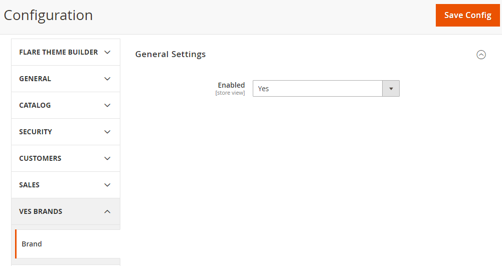
Brand Configuration
Under the General Settings, you must select the “Yes” to manage the brands.

Theme Configuration
Under the Theme Configuration, you can manage and design the Page Blocks and manage the contents of the Blocks.
From the Page Builder, you can select the Template among three templates for your Web store theme. The individual Blocks are provided to manage the content.

Manage Page Layouts
The layout of each page in your store consists of distinct sections, or containers, that define the header, footer, and content areas of the page. You can design your own store using the predefined layouts and blocks!
Navigate to THEME FLARE ⇒ Manage Page Layouts. Here the added page layouts can see.
Add New Page Layout
By clicking on the Add New Page Layout button, you can add a new Page Layout to create a new web store.
Select Status: To select Enable/Disable for Page Layout.
Select CMS Page: To select the added CMS page from the CMS Pages list. You can build the Page layout based on the selected CMS page.
Store View: Select the Store in that you want to add the CMS Page.
Note: You need to select the “Store View” only for the product listing page, the product details page, the Contact us page, and one-page-checkout.
Click on the Save Layout button. After adding the page layout, you can start designing.
Now click on the Design option to design the Page Layout from the Page Builder. As you click on it, you will be redirected to the Page Builder on the specific Page layout.


Page Layout Design
Choose a Template
From here you can design the Home page by choosing a Template and design the Block elements with drag and drop functionality.
Click on the Templates icon, you can see the three Themes under the Templates:
General (Template 1), Card (Template 2) & Apparel (Template 3).
Choose your required template for the selected page layout and navigate to the Block elements page to build and design the Web Page of the Store.
Blocks
Now, by clicking on Block icons, you can set and manage the Header, Footer, different content blocks like Banner, Offers, Top Deals, and many more. You can also manage the blocks for social media like Blogs, Instagram feeds, testimonials, and other relevant blocks.
You can change and replace any block with drag & drop the block snippets on the web page. You can also edit the content of the Blocks by clicking on the edit icon of any block from the Web Page.
Now, you can manage and design the different Blocks for your website as below:
– Header
– Banner
– Top Category
– Offer Selection
– Feature Products
– Blogs
– Trending Categories
– Testimonial
– Newsletter
– Instagram Feeds
– Static Content
– Brand
– Footer

")
Page Blocks (Predefined Layouts)
Edit the Predefined Blocks of the content from the web page. You can select the Templated based on the Web Store design. i.e. General, Cards, and Apparel.
You can move the Block up-downside by the ‘Move Element’ icon. You can delete any unwanted blocks from the web page by clicking on the delete icon.
Note: The selected Block snippet for the Web Page will appear in the blue border.


Header
Drag & drop the ‘Header’ snippet to the Webpage and it will replace the current one.
Edit Header
By clicking on the ‘edit’ icon of the Header block, the panel named “Header” will appear from the right side. From here you can enable/disable the Language Translator and Currency options to display on the Header.
After editing, click on the Save Page button from the upper-right corner.
Note: Based on the backend configuration of the selected Page, here you can provide the selection of the Language and the Currency on the web store to the customers.

Banner
Drag & drop the ‘Banner’ snippet to the Webpage to display the excellent products as banners.
Edit Banner (Slider)
By clicking on the ‘edit’ icon of the Banner block, the panel named “Banner” will appear from the right side. From here you can edit the existing Banner by clicking on the edit icon and delete if you want to remove it from the list of the Banner snippet.
Add Banner (Slider)
By clicking on the Add Slider button, you can directly add the banner inserting the details from the panel. Once the details: Title, Button Text, Button URL, Status, Description, and Image are added, click on the Save Slider button, the new slider will be added to the list of the Banner snippet.
After editing the banner block, click on the Save Page button from the upper-right corner.


")
Top Category
Drag & drop the ‘Top Category’ snippet to the Webpage to display the categories of different product types.
By clicking on the ‘edit’ icon of the Top Category block, the panel named “Top Category” will appear from the right side. From here you can edit the existing categories Title, Link & Image.
After editing the banner block, click on the Save Page button from the upper-right corner.


Offer Selection
Drag & drop the ‘Offer Selection’ snippet to the Webpage to display the offers on the products.
You can edit the text captions & labels directly from the Webpage content.
After editing the block, click on the Save Page button from the upper-right corner.

Featured Products
Drag & drop the ‘Featured Products’ snippet to the Webpage to display the latest/featured products.
By clicking on the ‘edit’ icon of the Featured Products block, the panel named “Featured Products” will appear from the right side. From here you can edit the Title and insert the No. of the products to be displayed.
After editing the block, click on the Save Page button from the upper-right corner.


Blogs
Drag & drop the ‘Blog’ snippet to the Webpage to display informative blogs, notes, or articles. By clicking on the ‘edit’ icon of the Blogs block, you can edit the Title of the Blogs block.
After editing the block, click on the Save Page button from the upper-right corner.


Trending Categories
Drag & drop the ‘Trending Categories’ snippet to the Webpage to display the products that most checked and purchased by the customers.
By clicking on the ‘edit’, the panel named “Trending Categories” will appear from the right side. You can enable/disable to display the Types of Trending: Best Sellers, New Products & Sales Product. You can also set the fancy Title.
After editing the block, click on the Save Page button from the upper-right corner.


Testimonial
Drag & drop the ‘Testimonial’ snippet to the Webpage to display the customers’ reviews of the products.
By clicking on the ‘edit’ icon of the Testimonial block, you can edit the Title and insert the No. of the Testimonial to be displayed.
After editing the block, click on the Save Page button from the upper-right corner.


Newsletter
Drag & drop the ‘Newsletter’ snippet to the Webpage to provide the subscription of the newsletter or any updates. You can add more than one Newsletter Block.
You can edit the Newsletter Title & its Description. After editing the block, click on the Save Page button from the upper-right corner.


Instagram Feeds
You can also add your Web Store’s Instagram profile on the Web page. You must get the Instagram access token key by registering the client ID. Drag & drop the ‘Instagram Feeds’ snippet to the Webpage to display the images/snaps from Instagram.
After editing the block, click on the Save Page button from the upper-right corner

Static Content
Drag & drop the ‘Static Content’ snippet to the Webpage to display how it works, steps, etc. You can ‘edit’ the text captions & labels directly from the Webpage content.
After editing the block, click on the Save Page button from the upper-right corner.

Brands
Drag & drop the ‘Brand’ snippet to the Webpage to display the available brands.
By clicking on the ‘edit’ icon, you will get the Manage Brands button that will redirect to the Mange Brands page.

Footer
Drag & drop the ‘Footer’ snippet to the Webpage to display details and menus of the web store.
By clicking on the ‘edit’ icon, you can manage the Footer details column-wise. You can edit the content and logos.


Product Listing & Detail pages
For the Product detail and listing page, the predefined layouts are provided to display the products and their details on your web store.
For that, navigate to the “Manage Page Layouts” and add a new Page layout or design the existing page of the product details and listing page.
You can edit and manage the Product listing and detail pages by keeping store specific.
Product Listing page
By clicking on the Design action of the ‘Product listing’ page, the product listing web page will open to design it.
By clicking on the Block icon from the left, you can drag & drop another layout as per your web store: General, Cards, or Apparel. There are 6 predefined layouts are provided.
By clicking on the ‘edit’ icon, you can configure the listing page details by enabling/disabling the Review/Rating Star, New Label & Sale Label options.
Product Details page
By clicking on the Design action of the ‘Product details’ page, the product details web page will open to design it.
By clicking on the Block icon from the left, you can drag & drop another layout as per your web store: General, Cards, or Apparel. There are 5 predefined layouts are provided for the detail page.
By clicking on the ‘edit’ icon, you can configure the details of the product details page by enabling/disabling the SKU, Stock Status, Review Summary, Short Description, Related Products, Up-Sell Products, Cross-Sell Products and selecting the Thumbnail Style: Vertical/Horizontal.
The layouts of the product listing and details page are fully responsive. You can design both pages using the predefined layouts and make your web store more creative and user friendly for the customers.


Contact Us Page
You can design the “Contact Us” page using the predefined layouts. Navigate to “Manage Page Layouts” and add a new page or design the existing pages.
By clicking on the Design action of the ‘Contact Us’ page, the contact us web page will open to design it.
By clicking on the Block icon from the left, you can drag & drop the layout. There are 2 predefined layouts are provided for the Contact Us page.
By clicking on the ‘edit’ icon, you can configure the details of the Contact Us page. The following details you can configure for the Contact Us page.
Validate Google map API: You can validate the inserted Google Map API Key once.
You can insert the opening Hours, Email with additional Email, Map address for contacting in any of medium.
You can show/hide the Google map from the Contact Us page. Insert Google map API Key.
Insert the Latitude & Longitude. Once you insert the “Latitude” & “Longitude”, the user icon on that location will be seen.
The layouts of the Contact Us page is fully responsive. You can design the page using the predefined layouts and make your web store more creative and user friendly for the customers.


Checkout Page
You can design the “Checkout” page using predefined layouts. Navigate to “Manage Page Layouts” and add a new page or design the existing pages.
By clicking on the Design action of the ‘Checkout’ page, the checkout web page will open to design it.
By clicking on the Block icon from the left, you can drag & drop the layout. There are 3 predefined layouts are provided for the checkout page.
By clicking on the ‘edit’ icon, you can configure the details of the checkout page. You can edit the Title labels for Information, Shipping Address, Shipping Method, Payment Method, and Order Summary.
The layout of Check out one page is fully responsive. You can design pages using predefined layouts and make your web store more creative and user-friendly for the customers.
In this way, you can add the snippet of the different Blocks as per your Web Store theme. The Font colors, style for Text and Button Text, effects will display as per the configuration in the Global Settings under General Configuration.
The Sliders for Banners will appear as per the configuration in the Slider Configuration under UI related General Configuration.
You can manage the following Blocks individually:
– Manage Blocks (Webpage Content Block)
– Manage Sliders
– Manage Testimonials
– Manage Brand Groups & Brands


Manage Page Blocks
You can add and manage the Page Blocks for different content block of the Web page.
Content blocks are sometimes referred as static blocks, or CMS blocks. You can use them to display fixed information such as text, images, and embedded video, as well as dynamic information from a widget or that, originates in a database or other source. Most elements on the home page are blocks that you can easily manage.
Navigate to THEME FLARE -> Theme Configuration -> Manage Page Blocks.
Here you will get the list of the Page blocks Slider in the grid view. You can search the Blocks by filter options and edit/delete unwanted blocks as well.
You can add a new Page Block by clicking on Add New Block button from the upper-right corner.
Add New Block
First, you must Enable the Block.
Block Title: Insert the title name of the Block. i.e. Biztech Apparel Footer
Identifier: Insert the Identifier text. I.e. Biztech-apparel-footer.
Store View: Choose the Store View where the block is to be available.
You can create custom blocks of content without writing any code and assign them to get appeared in a specific place in the page layout. You can add the text caption and design using WYSIWYG Editor or select the Widget or Images.
After inserting the details, Save the Block.
Note: This Block content can be selected for the Category in the Content tab under Add CMS Block dropdown option.


Manage Sliders
The slider is a powerful marketing tool that helps you create the sliders for Banners, Discount Offers, Sales, etc.
Uploading colorful and high-quality images is a great way to enhance your site appearance. It makes your website more impressive, professional which could improve the experience of customers and encourage them to view banners as well as get the information you want to share.
Navigate to THEME FLARE ⇒ Theme Configuration à Manage Sliders. You will get the list of the Slider in the grid view. From here you can search the Sliders by filter options. You can enable/disable, edit any Sliders, and delete unwanted Sliders as well.
You can add a new Slider by clicking on Add New Slide button from the upper-right corner.
Add New Slide
First, you must Enable the Slide status.
Title: Insert the title name of the Slider. i.e. Offer, New Arrivals, Marketing Campaign, etc.
Description: Insert the Description related to Slider purpose or subject. You can add the text caption and design using WYSIWYG Editor or select the Widget or Images.
Image: Select the high-resolution quality images to display on the slider.
Insert the other detail as per your Slider design like Button Text and its URL when the customer will click on it.
Similarly, you can insert the Button Text and its URL for the Additional Button. Insert the Sort Order.
After inserting the details, Save the Slider.
This way, you can insert the Slider and display on your website for Banner, Offer, or Marketing Campaign.


Manage Testimonials
All visitors are really interested to know what other shoppers think about your products and Web store and how they appreciate the store services, etc. By placing a testimonial, you will be able to show more user impressions of your store products.
You can add and manage the Testimonials to display on your website.
Navigate to THEME FLARE ⇒Theme Configuration à Manage Testimonial. You will get the list of the Testimonials in the grid view. From here you can search the Testimonial by filter options. You can enable/disable, edit any Testimonials, and delete unwanted Testimonials as well.
Add New Testimonial
You can add a new custom Testimonial by clicking on the Add New Testimonial button from the upper-right corner.
Add New Testimonial
First, you must Enable Testimonial status.
Title: Insert the title for the Testimonial. i.e. Insert the relevant person name.
Position: Insert the details of the person position in the company.
Company Name: Insert the Company.
Content: Manage the descriptive testimonial message to display on the Web site. You can add the text caption and design using WYSIWYG Editor or select the Widget or Images.
Live site: Insert the live URL of their Store.
Client Image: Insert Company Log or Client Portrait image.
Sort Order: Insert the Order number to display in sequence.
After inserting the details, Save the Slider.
In this way, you can add and manage the Testimonial and display on your web store by adding the Testimonial in the Web page of Page Layout design (Page Builder).


Manage Brand Groups & Brands
Brand loyalty has a great impact on customer behavior. With the trust in a brand status, customers tend to search for their favorite brand’s products in a store, regardless it is an online one or a brick and mortar.
Manage Brand Groups
You can manage the Brand Groups to display the brands’ group wise. i.e. Our Exclusive Footwears!
Navigate to THEME FLARE ⇒Theme Configuration ⇒Manage Brand Groups. You will get the default Brand Group here.
You can add a new Brand Group by clicking on Add New Brand button from the upper-right corner.
Group Name: Insert the relevant Group name. i.e. Footwears, Sunglasses
URL Key: Insert the URL.
You enable the Sidebar to display the different options.
After adding the Brand Group, you can select the particular Brand in the relevant Brand Group.
Manage Brands
You can manage the Brands to display the brands on the Webstore, it will allow your customers to find their favorite brands in your store without hassle.
Navigate to THEME FLARE ⇒Theme Configuration ⇒Manage Brands. You will get the default Brands list.
You can add a new Brand by clicking on Add New Brand button from the upper-right corner.
Brand Name: Insert the Brand name.
URL Key: Insert the URL.
Brand Group: Select the Brand Group from the drop-down option. So, you can provide the brand under the particular Brand Group as well. i.e. Our Exclusive Footwears!
Image: Select the Brand Image.
Thumbnail: Select the image to display as Thumbnail.
Description: Insert the Brand description in short details. You can add the text caption and design using WYSIWYG Editor or select the Widget or Images.
Store View: Choose the Store View where the block is to be available.
Status: You can enable/disable the Status of the Brand.
After inserting all the details, Save the Brand.
In this way, you can add the Brand Groups & Brands and help online stores improve product search. You can select the brand for the products and display them on the Web Store.


Mega Menu
Theme FLARE provides the Mega Menu management that often used on sites that have a considerable number of Products with multiple Categories for users to navigate.
Under the “Theme FLARE”, the mega menu provides menu customization to design the main menu in your desired way!
Navigate to the Theme FLARE to configure the Mega Menu for your stores. Under the Mega Menu Configuration section, you will get the three configurations to setup the Mega Menu for your stores:
– Manage Custom Items
– Manage Custom Blocks
– Manage Menus

Manage Custom Items
First, navigate to the “Manage Custom Items” to Insert the items by defining whether it is the title of the menu or any product name. Under the custom items, you can manage the individual items of the Mega Menu.
Add a new custom item by clicking on the “Add New Custom Item” button. By clicking on it, you will navigate to the ‘Add Custom Item’ page.
Name: Insert the relevant name of the custom item
Link Type: Select the type to link the custom item with it to navigate to the customers. There are three types:
“Custom Link”, “Category Link” and “Product Link”
CMS Page: Select the CMS page added under the Page Layouts.
Link: Insert the custom navigation link. If you have selected the “Custom Link” as Link Type, you need to insert the link.
Is Title: By selecting “Yes”, the added custom items will be available for parent selection while creating custom blocks.
Status: Enable/Disable the custom items as per your need.
Link Type:
1. If you have selected the “Custom Link”, the CMS page & Link options will enable. Select the CMS page and insert the navigation link.
2. If you have selected the “Category Link”, the Category list will open. Select the Category to navigate the custom item (product) under that category.
3. If you have selected the “Product Link”, the Product list will open. Select a Product from the list to navigate the customers by clicking on the Custom item.
Click on the “Save” button to save the custom item that will appear in Mega Menu.


Manage Custom Blocks
You can add the custom block to display under the Mega Menu of the store (Frontend) either by selecting the products under a specific Category or by selecting Parent & Child list from the Custom Items.
Navigate to the “Manage Custom Blocks”, to add the blocks under the Mega Menu. You can edit the Custom Blocks from the list or add a new custom block as well by clicking on the “Add New Custom Block” button.
Block Name: Insert a relevant Block name. i.e., Electronics, Sports shoes, etc.
Block Type: Select the type to display the list of the block either from ‘exiting categories and products’ or from ‘custom item’ by selecting the Parent & the child items.
Note:
If you select the ‘existing categories and products’, you need to select a ‘Category’ from the list & the list of the products will appear as per the selection of the Category. The category will be set as Title and the selected products will be listed under that title (category).
But if you select the ‘Custom Items’, you need to select the ‘Parent List’ & ‘Child List’ of the custom items. The custom items which set as “Is Title” at the time of adding the Custom Items will be listed in the Parent List and custom items that did not set as “Is Title”, that will be listed in the Child List.
Once you added the details, click on the “Save” button to save the Custom Block. Once the custom block is added, you need to configure the Menu to select the blocks under a specific menu.


Manage Menus
After inserting the Custom items and creating a block using existing Category & Products or selecting the custom items, you need to manage the menu by selecting the layout of the menu. For designing the Menu layouts, the different snippets are provided.
Navigate to the “Manage Menus” to configure the header menu with a list to display on the store (Frontend) to the customers. You will get the list of the existing Menus. You can edit any existing Menu from the list, or you can add a new menu by clicking on the “Add New Menu” button as per your requirement.
Name: Insert the relevant name of the Menu that can identify in the future as well. The name that you insert it will not appear in the menu. For that, you need to configure the Page Layout.
Snippet: There are 5-snippets are provided to customize the menu layout. To preview any ‘Snippet’, select the Snippet and click on the “Structure Preview” button. It will display the layout preview of the selected snippet for the store view. So, you can manage the layout as per the selection of the Snippet.
Here you can select the Store View to display the snippet in it. You can decide in which store do you want to display the snippet.
Snippet-1:
If you select the Snippet-1, you can ‘Preview’ that snippet and you need to manage the below menu content:
Custom Blocks: You need to select the blocks that are added in the “Manage Custom Blocks”. You need to decide which block you want to display and provide to access the customer from the store.
By clicking on the “Add Custom Block” button, you will get the block selection dropdown option from the right side with its relevant name. You can add more than one block under the menu.
If you are editing the existing “Menu”, you can also edit selected custom blocks by clicking on the ‘edit’ icon and want to remove them by clicking on the ‘delete’ icon.
After configuring the Snippet, click on the “Update” button to modify/save the configuration.
Product Slider: By clicking on the ‘Product Slider’ tab, you can display the products with images in the slider. The slider will appear on the right side of the menu layout.
Click on the “Save” button to save all the modifications/updates.
Snippet-2:
If you select the Snippet-2, you can ‘Preview’ that snippet and you need to manage only a “Custom Block”:
Custom Blocks: You need to select the blocks that are added in the “Manage Custom Blocks”. You need to decide which block you want to display and provide to access the customer from the store.
By clicking on the “Add Custom Block” button, you will get the block selection dropdown option from the right side with its relevant name. You can add more than one block under the menu.
If you are editing the existing “Menu”, you can also edit selected custom blocks by clicking on the ‘edit’ icon and want to remove by clicking on the ‘delete’ icon.
After configuring the Snippet, click on the “Update” button to modify/save the configuration and click on the “Save” button to save all the modification/updates.
Snippet-3:
If you select the Snippet-3, you can ‘Preview’ that snippet and you need to manage Menu with its link:
Menu: You can provide just menu links in the Menu. You need to select the Link Type: Custom, Category or Product with the relevant Link name to identify.
Custom Link: You need to select the “CMS page” from the list and insert the “Custom Link” to redirect the customers to that specific CMS page.
Category Link: You need to select the required “Category” from the existing category list to redirect the customers to that specific category page.
Product Link: You need to select the “Product” from the existing product list to redirect the customers to that specific product page.
Snippet-4:
If you select the Snippet-4, you can ‘Preview’ that snippet and you need to manage the below menu content:
Image Block: You can display the “image” of the product (or category) on the menu by uploading the image and selecting a “Link Type”: Custom, Category, or Product Link (like Snippet-3).
After configuring the Snippet, click on the “Update” button to modify/save the configuration.
Left Image: By clicking on the ‘Left Image’ tab, you can display a fixed image by uploading the image and selecting a “Link Type”: Custom, Category, or Product Link (like Snippet-3).
After configuring the snippet, click on the “Save” button to save all the modifications/updates.
Snippet-5:
If you select the Snippet-5, you can ‘Preview’ that snippet and you need to manage the below content:
Custom Blocks: You need to select the blocks that are added in the “Manage Custom Blocks”. You need to decide which block you want to display and provide to access the customer from the store.
Image Slider: By clicking on the ‘Image Slider’ tab, you can add more the one images to display the product/category images on the menu by uploading the image and selecting a “Link Type”: Custom, Category, or Product Link
Footer Image: By clicking on the ‘Footer Image’ tab, you can display a fixed image in the footer of the menu by uploading the image and selecting a “Link Type”: Custom, Category, or Product Link.
After configuring the Snippet, click on the “Update” button to modify/save the configuration and click on the “Save” button to save all the modification/updates.


Mega Menu configuration under Page Layouts
After configuring the Mega Menu sections by managing the Custom Items, Blocks & Menu Snippets, you need to configure and edit the Mega Menu content in the Page Layouts block.
Navigate to Theme FLARE -> “Page Layouts” under the Theme Configuration section. You will get all the designed page layouts as per the selection of the stores. Click on the “Design” button to select the required page layout for which you want to edit the Mega Menu.
Now, navigate to the page layout block editor. You can edit the Mega Menu by clicking on the ‘Edit’ icon of the header block.
By clicking on the ‘edit’ icon, the slider will appear from the right side to edit and configure the Mega Menu content & links.
Menu Configuration: To set W2P Store Mega Menu, you need to select the “Mega Menu” option. By selecting the ‘Default Menu’ option, it will display the default Magento Menu.
Add Menu: You can add more menu by clicking on the Add Menu button. By clicking on it, you need to insert the Menu name, select the ‘Link Type ‘, and Mega Menu that added under the ‘Manage Menu’ by configuring the snippet.
Edit Menu: You can edit the existing menu, by clicking on the ‘edit’ icon. You can edit the menu text caption, change the ‘Link Type’ and the ‘Mega Menu’ display.
Once you add a new menu or edit the existing one, click on the update button after add/edit the content.
By editing the content and configure the Mega Menu from the Page Layouts edit blocks, click on the Save Page button to save all the changes & updates. The customers will get the Mega Menu with the text caption that edited under the edit block from the Page Layouts.


Mega Menu view in Store view (Frontend)
The customer can see the Mega Menu with different options that set from the page builder.

