CommerceXpand Apps
CommerceXpand: All-in-one Shopify apps
About CommerceXpand
Shopify-CommerceXpand is a number of Shopify apps in one for Shopify merchants to manage the backend operation related to the product management, abandoned orders, provide the discount with count down of the time, and many others.
CommerceXpand is an all-in-one solution for many stand-alone apps. Shopify merchant can manage the website as per own business aspects.
Here are the apps of the AppJetty Shopify – CommerceXpand:
-> Boost Revenue
– Bulk Product Editor
– Product Bundles
– Pre Order
– Volume Discounts
-> Increase Conversion
– Sticky Cart
– Back in stock alert
– Abandoned Checkouts
– Count Down Manager
– Inactive Tab
– Favicon Cart Count
– Recently Viewed Products
-> Improve Experience
– Image & SEO Optimizer
– Currency Converter
– Facebook Messenger Chat
-> Build Trust
– Product Review
-> Capture Leads
– Announcement Bar
-> Fine Tune Store
– Scroll to Top
– Order Export
– Auto External Links
– Hide Dynamic Checkout Buttons
-> Store Protection
– GeoIP Redirect
– GeoLocation Block
– Content Secure
– Cookie Bar
– Best Seller Protection
– Hide SEO Products

CommerceXpand- Dashboard
Once you navigate to the CommerceXpand Dashboard, you will get the analytics of “Image Optimizer”, “Bulk Editing operations”, and “available Emails”. Based on the records, you can check the availability of the actions performed and you can manage and keep your eCommerce store updated.
You can also purchase extra plans:
– Emails to send Abandoned Checkouts and Back in Stock alert emails to customers,
– Bulk Edits to edit the product details in bulk, and
– Image Optimizer to edit and optimize the images (Compose, Tag & Filename). Restoring the images will also be calculated in Image Optimizer records.
Click on Purchase More Email / Edits / Image Optimization > to purchase extra plans.
By clicking on it, you will get the Extend Plans popup to purchase extra Emails, Bulk editing, or Image Optimization. You will get the plan details from the drop-down option individually.


Installation
– Login to Shopify as Admin.
– Search the AppJetty CommerceXpand- Abandoned Carts.
– After selecting it, you will find the ‘Add App’ button, click on Add App button.
– As you click on the ‘Add App’ button, the ‘Log in to your Shopify store’ pop-up will be prompted.
– Insert your Shopify store link and click on Log in button. You will be redirected to the Install page.
– Now install the app by clicking on Install App button.

Abandoned Carts Configurations
By clicking on “Abandoned Carts”, you can check how many carts are abandoned by the customers and send the recovery mail to the customers.

List view records
You will get the list of records of the abandoned carts with details like ID/Email, its Date & Time, Cart Amt., Email Status, Status of recovery, Action button to send the mail.
The search option is provided to search the specific order by inserting the ‘Order ID’ or ‘Email ID’ of the customer
You can set the records per page from the pagination option ‘Show Entries’.

Send Email
If you want to send an Email of the reminder to the customer of their incomplete purchase process, click on the ‘send’ icon, the customer will get an Email of the incomplete purchase.
On getting the mail, the customer who forgot the complete the checkout process, can continue with the checkout process and make payment of their incomplete order from the email’s details.
If you have sent the reminder through email, you will get the “Email Status” as Sent with the counter of sent emails.

Send Email in Bulk
You can send the mail by selecting multiple abandoned carts to the customers using the ‘Bulk’ action.
By selecting abandoned cart records, the Bulk Send Email button will be enabled. By clicking on that button, you can send the reminder mail of multiple abandoned carts to the customers.

Recovered Abandoned Carts
Once the customer completed the incomplete purchase process and made a payment, the ‘Status’ of the Abandoned cart records will be updated to the Recovered.
Once the status is updated to the ‘Recovered’, you cannot edit that record anymore and the details will be updated on the “Recovery Dashboard” as well.

Recovery Dashboard
After installation, you will get the “Abandoned Checkout”. By clicking on it, you will navigate to the ‘Recovery Dashboard’.
From the ‘Recovery Dashboard’, you will get the latest values related to Abandoned Carts and Recovered Carts with a percentage as per the selection of the dates from the ‘date filter’.
Your Latest Numbers: The abandoned cart details will be displayed as per the specific interval or custom date range selection.
Compare with Preceding Period: Here the compare date range will appear as per the selection of the interval or date range. i.e., if this month is selected, record details compare with the last month.
You will get the following values for Abandoned Carts with the latest value and with the percentage of increase:
– Abandoned Carts: You will get the No. of Abandoned Carts from the customers.
– Email Sent: You will get the No. of Emails sent to the customers.
– Cart Recovered: You will get the No. of recovered carts from the abandoned carts that the customers checkout after getting the email.
– Recover Rate: You will get the percentage of the recovered carts in comparison with the Abandoned Cart as per the selected date range/date filter.
– Cart Value Recovered: Value (revenue) of the recovered carts.


Recovery Scheduling
You can set up the mail scheduling of abandoned checkouts by enabling the automated Abandoned Cart recovery emails.
To set up the automated abandoned cart recovery emails that send the incomplete checkout reminder to the customers automatically, enable the “Send recovery cart emails automatically” option.
Once that option is enabled, you can set up the No. of recovery mail to be sent in a certain time interval:
– No. of recovery Emails: You can select a maximum of 3 emails.
– Sent After (Days): Set the days to send the recovery emails to the customers again after some days of the previously sent.
Once the automated recovery email is setup, click on the Save button.
As per the setup, the customers will get the email of the incomplete checkout process to recover the orders.


Customize Email
You can customize the email template with a Live preview of the email design, and the ‘Send test Email’ option is provided to check how the email will look.
From the left, you can edit & design the content of the email and from the right, you will get the ‘Live Preview’ as you have designed the email template.
Add the ‘logo’ and insert the relevant ‘Subject’.
You can also insert the ‘template variables’ to get the details/records of the customers. The variables fill in specific content elements related to the customer details. Here, you can use the following template variables:
-> {%-customer_name-%} -> {%-customer_email-%}
-> {%-checkout_url-%} -> {%-shop_name-%}
By clicking on the Save button, the template will be saved as you have designed.
By clicking on the Send Test Email button, you can check the Test Email on the inserted Email Id to get the Test Email to check how it looks if you send the final Mail to the customers of their abandoned carts.
In this way, Abandoned Checkout will help the Shopify merchants to increase the sales from carts that are abandoned and complete the checkout process by the customers.


Installation
– Login to Shopify as Admin.
– Search for AppJetty CommerceXpand- Sticky Add To Cart.
– After selecting it, you will find the ‘Add App’ button, click on that.
– As you click on the ‘Add App’ button, the ‘Log in to your Shopify store’ pop-up will be prompted.
– Insert your Shopify store link and click on Log in button. You will be redirected to the Install page.
– Now install the app by clicking on the Install App button.
Sticky Cart Confgurations
You can manage the Sticky Add to Cart for the desktop and for the mobile view individually. You must have enabled the Sticky Cart. Let’s see how to configure and customize the Sticky Cart.

For Desktop
By clicking on the ‘Sticky Cart’, you will get the Sticky Cart tab for the Desktop. Under ‘Desktop’, you can configure sticky cart action options and customize the style of the Sticky Cart icon. (Screenshot: 1.For Desktop )
– Enable Desktop Switch: You need to enable this option if you want to display the sticky cart for desktop users.
– Position on Desktop: You can set the position of the Sticky on the desktop screen. As you select the position, the sticky cart icon will change the position in the Preview, so you will see exactly where the Sticky cart will appear on your store (website) of the desktop screen. (Screenshot: 2.Set Position )
– Custom Top/Bottom: You can set the custom position at Top/Bottom level by inserting the percentage of the position. (Screenshot: 3.Set Custom Position )
– Button action on click: You can select the navigation (action) option that navigates the customers when they click on the Sticky cart icon. You can navigate them either to Cart Page or directly to the Checkout Page by skipping the Cart page. (Screenshot: 4.Select Action on Click)
You can configure the Style Settings for the Sticky Cart icon as per the store’s theme. (Screenshot: 5.Style Settings)
Style & Size of Sticky Cart
– Style Settings: You can choose the Sticky cart icon that suits the store (website).
– Button Size: You can set the button size large by scrolling right, and small by scrolling left.
Icon Color & Background Color of Sticky Cart (Screenshot-1: )
– Icon Color: You can choose the Sticky cart icon color that is relevant to your store.
– Button background color: You can choose the background color of the sticky cart button (icon).
– The color picker tool is provided for both “Icon color” & “Button background color” to customize the color. (Screenshot: 6.Color Picker)
Note: You will get the “Live Preview” as you configure the options and customize the style.


For Mobile
By clicking on ‘Mobile’, you can configure sticky cart action options and customize the style of the Sticky Cart icon for the mobile screen. (Image: 1.Sticky Cart for Mobile)
– Enable on Mobile Switch: You need to enable this option if you want to display the Sticky Cart for mobile users.
– Position on Mobile: You can set the position of the Sticky on the mobile screen. As you select the position, the sticky cart icon will change position in the Preview, so you will get exactly where the Sticky cart will appear on the store (website) of the mobile screen.
– Button action on click: You can select the navigation (action) option that redirects the customers when they click on the sticky cart icon from the mobile screen. You can navigate them to either the Cart Page or directly to the Checkout Page by skipping the Cart page. (Image: 2.Configuration for Mobile)
– Style Settings: You can choose the Sticky cart icon that suites the store (website).
– Button Size: You can set the button size large by scrolling right, and small by scrolling left.
– Icon Color: You can choose the Sticky cart icon color that is relevant to your store.
– Button background color: You can choose the background color of the sticky cart button (icon).
The color picker tool is provided for both “Icon color” & “Button background color” to customize the color.
Note: You will get the “Live Preview” on the mobile screen as you configure the options and customize the style.


Quick Buy button
You can set the “Quick Buy” button on the product list page or product detail page to provide the customers a way to add the product into the cart quickly. You can manage the Quick Buy button for the desktop and for the mobile screens individually.
You must have enabled the Quick Buy button. Let’s see how to configure and customize the Quick Buy button.
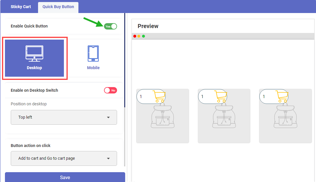
For Desktop
By clicking on the Desktop under the ‘Quick Buy Button’ tab, you can configure Quick buy action options and customize the style of the Desktop screen.
– Enable on Desktop Switch: You need to enable this option if you want to display the Quick Buy button for desktop users.
– Position on Desktop: You can set the position of Quick Buy on the desktop screen. As you select the position, the Quick Buy button will change the position in the Preview, so you will see exactly where the Quick buy button will appear on the store (website) of the desktop screen.
– Custom Top/Bottom: You can set the custom position at Top/Bottom level by inserting the percentage of the position.
Button action on click: You can select the navigation (action) option that redirects the customers when they click on the Quick buy button from the desktop screen. You can select any one option:
> Allow adding the product to the cart and the customers can continue with shopping,
> Add product to the cart and navigate to the cart page or
> Directly to the Checkout Page by skipping the Cart page.
– Style Settings: You can choose the Quick buy icon that suits the store (website).
– Button Size: You can set the button size large by scrolling right, and small by scrolling left.
– Icon Color: You can choose the Quick buy icon color that is relevant to your store.
– Button background color: You can choose the background color of the Quick buy button (icon).
– The color picker tool is provided for both “Icon color” & “Button background color” to customize the color.
Note: You will get the “Live Preview” as you configure the options and customize the style.


For Mobile
By clicking on ‘Mobile’, you can configure Quick buy action options and customize the style for the mobile screen.
– Enable on Mobile Switch: You need to enable this option if you want to display the Quick Buy button for mobile users.
– Position on Mobile: You can set the position of the Quick buy on the mobile screen. As you select the position, the Quick buy button will change the position in the “Preview”, so you will see exactly where the Quick buy button will appear on the store (website) of the mobile screen.
– Custom Top/Bottom: You can set the custom position at Top/Bottom level by inserting the percentage of the position.
– Button action on click: You can select the navigation (action) option that redirects the customers when they click on the Quick buy button from the mobile screen. You can select any one option:
> Allow adding the product to the cart and the customers can continue with shopping,
> Add product to the cart and navigate to the cart page or
> Directly to the Checkout Page by skipping the Cart page.
– Style Settings: You can choose the Quick buy button style that suites the store.
– Button Size: You can set the button size large by scrolling right, and small by scrolling left.
– Icon Color: You can choose the Quick buy icon color that is relevant to your store.
– Button background color: You can choose the background color of the Quick buy button (icon).
– The color picker tool is provided for both “Icon color” & “Button background color” to customize the color.
Note: You will get the “Live Preview” on the mobile screen as you configure the options and customize the style.

Frontend View
The customer will get the sticky cart. By clicking on it, either they can navigate to the Cart page or directly navigate to the Checkout page as you have set.
The customers will get the “Quick Buy” button on the product listing page and by clicking on the Quick Buy button, they can wil get the variation selection and they can perform the actions as you have set.


Product Bundles Configurations
After installation, you will get the Product Bundles app in your App list. Let’s configure and setup the Product Bundle by selecting the products and making one combo or bunch.

General Settings
By clicking on the “Product Bundle”, you will navigate to the Settings page and configure the products as a bundle.
First, you must enable the “Product Bundle” app to display the combo products on the product page of your store. Click on the toggle button to enable/disable (Yes/No).
– Show Original Product Price: Tick the checkbox of this option to display the total amount of the product bundle.
– Show Discount Price: Tick the checkbox of this option to display the discounted amount of the product bundle.
– Actual Price appearance: Here you can decide how to display the actual price to the customers. Display the “actual price” as it is or show the actual price with a strikethrough.
Note: If you display the actual product price by strikethrough, the customers may get attracted to check the product discount and product details.
After configuring the details under the ‘Settings’ tab, click on the Save button.

Product Bundles- List View
You can check already created Product Bundles. By clicking on the “Product Bundles”, you will get the list of the existing Product Bundles with their details in grid view.
In the grid view, you can see the Status, Bundle Name, Product bundle images, Discount Type & Priority as you have added the details during the creation of the bundle.
You can search the specific bundle from the list of the bundles by inserting the name or text in the ‘Search text box’. You can enable/disable the status of the product bundle as per need.
Under “Actions”, you can ‘edit’ the specific bundle and you can also ‘delete’ any bundle that is no longer required.
By clicking on the ‘edit’ icon, you can edit the bundle details and update the bundle.
You can add a new product/replace existing/remove the products as you want to display the product to sell more. You can change the discount for the bundle any time you want.
You can edit the bundle message to attract the customer to visit the product bundle.
By clicking on the + Create Bundle, you will navigate to the “Create Bundle” page to create a new product bundle.
Create Bundle
Now, by clicking on the + Create Bundle from the ‘Product Bundles’ page or clicking on the Create Bundle tab, you can create a new Product bundle by selecting the products, applying the discounts, selecting the priority.
– Bundle Name: Insert a relevant & eye-catching name of the Bundle.
– Choose Bundle Products: By clicking on the + Add Product, you can select the required products to make as a bundle (combo).
– By clicking on the + Add Product, you will get the list of the enabled products to select for the bundle.
Once you select the products, you will get the “No. of product selection”. After selecting the products, click on the Add button to add the selected product to the bundle.
Note: You can select a minimum of 2 products and a maximum of 5 products to display as a product bundle/ product combo.
You can see all the selected products. You can also increase the ‘Qty’ of the products as you want to sell maximum products from the product bundle. You can delete the product by clicking on the ‘delete’ icon.
Set discount for the products:
You can set the discount by choosing any discount type: Fixed Amount or % Discount.
If you select the Fixed Amount, you need to insert the fixed amount. The final price will display after deducting the inserted fixed amount from the actual amount.
If you select the % Discount, you need to insert the percentage of the discount. The final price will display by calculating the inserted percentage and deducting it from the actual amount.
If you don’t want to provide any discount to the customers, select No Discount, which will display the actual price.
Note: You can also change the discount later by editing the bundle record from the “Product Bundle” list.
– Priority: Set the bundle priority. If there is one product that is added into more than one bundle, the customers will get the Product bundle as per the highest priority set for the bundle. 1 is the highest priority and 5 is the lowest priority.
– Bundle Message: Inset the bundle message to display to the customers regarding the product bundles.
– Button Text: Insert the button text caption.
After selecting the products and inserting the details, click on the Save button to add a new product bundle.
Once you add the product bundle, it will display in the list of the Product Bundle.


Integration
You need to add the file to display the ”Product Bundle” in your store. Until then you will get the status as “Not Created”.
By clicking on the Create File button, it will create a file in the theme.
Once the file is created, you will get the status as “Created”. You need to add the code {% include ‘product bundle’ %} manually on the product page.
The bundle will display on your store only when you have created a file and included it on the product page.


Frontend View (Store View)
Once the customers access your store and click on the product that is already in the product bundle, the product bundle will load once they navigate to the product detail page.
Here the customers will get the Bundle’s ‘Title’, ‘Message’, and discount calculation as per the Bundle’s configurations.
The Price is displayed with a discount & strikethrough as per the configuration under the “Settings” tab of the product bundle.

Image & SEO Optimizer
After installation, you will get the Image & SEO Optimizer app in your App list. Let’s see how to configure and setup the Image Optimizer.
You can check and configure the following options for SEO specific image optimization:
Dashboard: View Analytics of the optimized images.
Optimize Settings: Personalize the Optimization settings for ‘Alt Tags’ and ‘Filename’ for SEO-friendly images with Auto editing and Automatic compression options.
Image Optimizer: Perform the actions for single or multiple images to optimize the images of the Products, Collection, Asset (Theme) & Article (Blog).
Running Process: Check the status of the optimization process with its name and process duration.

Dashboard
By clicking on the “Dashboard”, you will get the analytics of the “Image Optimizer”.
You can see the “Total No. of action performed” for all the Images:
-> Images Compressed
-> Files Renamed
-> Alt Tag Renamed
-> Total MBs saved after compressing the images
You can see the image optimization ratio in percentage for ‘Compression’, ‘File Name’ & ‘Alt Tag’.
You can see the ratio comparison of the total images in the ‘Pie chart’ for the Products, Collections, Assets & Articles. By hovering the mouse on a pie chart, you will get the details as well.
From the Dashboard, there are two ‘quick action’ options are provided:
-> Start Compression: By clicking on this action, it will start the image compression for all the images.
Note: “Image compression” is a major part of image optimization. It is how you take a large image and turn it into a smaller one.
-> Running Optimization: By clicking on this action, you will be navigated to the ‘Running Process’, from where you can check the currently running process if any.


Optimize Settings
You can configure the Alt Tag and Filename for the Products, Collections & Blog Posts. You can also enable the auto options for Alt Tag, File Name, and Image compression.

For Alt Tag
Search engines such as Google look at ‘Alt tag’. If you use alt tags correctly, you can help search engines to find the images and display them in search engine results as well.
Configure the Alt Tag options:
Enable automatic alt tag addition for new products: Enable this option to insert the Alt Tags as per the Alt tag pattern when the new products are added.
Update only empty alt texts: Enable this option to update only those Alt tags that are left empty.
> Choose “Alt Tag pattern” for Product images: You can configure the Alt Tag caption as per the product details.
-> [product_title] [product_type] [product_vendor] – If you select this option, the alt tag of the product images will update as per the Title of the product, product type & its vendor.
-> [product_title] – If you select this option, the alt tag of the product images will update as per the Product’s Title.
-> Custom – You can add the custom ‘Alt tag’ manually. You can use the variables like [product_title] [product_type] [product_vendor] and you can add a prefix for the ‘Alt tag’ as well.
> Choose “Alt Tag pattern” for Collection images: You can configure the ‘Alt Tag’ caption as per the Collection details.
-> [collection_title] (Recommended): If you select this option, the alt tag of the collection images will update as per the Title of the collection.
-> Custom – You can add the custom ‘Alt tag’ manually for the Collection images. You can use the variable for the articles as well. i.e. [collection_title]
> Choose “Alt Tag pattern” for Blog Posts images: You can configure the ‘Alt Tag’ caption as per the Blog Post (Article) details.
-> [article_title] (Recommended): If you select this option, the alt tag of the article image will update as per the Title of the Article (Blog post).
-> Custom – You can add the custom ‘Alt tag’ manually for the Blog posts images. You can use the variable for the articles as well. i.e. [article_title]


For File Name
With image file naming, it could be descriptive and include keywords that may be relevant.
> Configure the File Name options:
-> Enable automatic file addition for new products: Enable this option to insert the ‘image filename’ as per the File name pattern when the new products are added.
> Choose “Filename pattern” for Product images: You can configure the Alt Tag caption as per the product details.
-> [product_title] [product_type] [product_vendor] – If you select this option, the file name of the product images will update as per the Title of the product, product type & its vendor.
-> [product_title] – If you select this option, the file name of the product images will update as per the Product’s Title.
-> Custom – You can add the custom Filename manually for the product images. You can use the variables like [product_title] [product_type] [product_vendor] and you can add a prefix for Image Filename as well.
> Choose “Filename pattern” for Collection images: You can configure the ‘Filename’ caption as per the Collection details.
-> [collection_title] (Recommended): If you select this option, the File name of the collection images will update as per the Title of the collection.
-> Custom – You can also add the custom Filename manually for the collection images. You can use the variable for the collection as well. i.e. [collection_title].
To Enable automatic compress option: Enable this option to compress the images automatically when the new images are added.
After configuring the Image Optimizer settings, click on the Save button to apply the configurations.


Image Optimizer
From the “Image Optimizer” tab, you will get the listing of all the image types with optimization details in grid view.
You can see the image with its type, title, and the following details from the grid view:
-> File Name
-> Alt Tag
-> Compressed File with the percentage
-> Action
The page navigation is also provided to navigate to the specific page, and you can also set the records per page.

Resync Asset & Articles
You need to resync the asset images (theme images) and article images (blog images) manually by clicking on the Resync Asset and Resync Articles buttons, respectively.

Image Types
By default, you will get a list of all the types. You can sort the images and get the list of the images by selecting the following image type:
-> Collection
-> Products
-> Blogs (Articles)
-> Theme (Assets)
You can also search the specific image by its ‘title’.
If you have selected the ‘Products’ type, you will get all the images of the products.


Image Optimization actions
Under the ‘Action’ option, by clicking on the down arrow you can perform the following operations regarding the image optimization:
-> Compress
-> Optimize Alt Tag
-> Optimize Filename
-> Restore
Note:
– You can perform just two operations for the “Asset” type images: “Compress” & “Restore”. The image “Filename” & “Alt Tag” will not support the Asset typed images.
– You will get the “Restore” option only when you have already optimized the images.
If any action is not performed of the image optimizer, you will get the Not Optimized status for the specific operation.
You can perform any operation for individual image records. Click on the down arrow, you will get the 4-options to perform any optimization operations.
Ex. For the Collection type image, the Alt Tag is not optimized, so by clicking on the “Optimize Alt Tag” option, you can update the Alt Tag for that image. The Alt Tag will be updated as per the configuration as per the Alt Tag image pattern.
Once the operation is performed you will get the success message.


Image Details
You can also check the details of the image by clicking on the Detail button for the individual image record.
By clicking on the Detail button, you will navigate to the Detail page of that specific image details.
From the Image details page, you can see the following details:
> Image Type
> Status of the Image optimization operations (Compressed, Alt Tag & Filename)
> Original Size & dimensions of the image
> Optimized details: Size, Alt Tag & Filename
You will get the Image comparison “before compressed” & “after compressed”, so you can check the clarity of the image and if the clarity is not proper, you can Restore the image as it is in original form.
Optimization Actions
From the image details page, you can also perform the optimization actions.


Running Process
By clicking on the Running Process, you can check the optimization process for the images.
If the process is running, by clicking on the “Refresh” button, you will get the percentage of the status of the process.
In this way, you can configure the Image Optimization Settings, perform the image optimization action for individual image records or in bulk and check the optimization process status.

Bulk Product Editor Configurations
After installation, you will get the Bulk Product Editor app in your app list. Let’s configure and setup how to edit the Product details in bulk.

Home
By clicking on the “Bulk Product Editor”, you will navigate to the Home page and configure the editing of the products in bulk.
You can Edit the following product attributes:
-> Inventory
-> Price
-> Compared At Price
-> Product Type
-> Tag
-> Title
-> Vendor
-> Weight
Enable scheduled bulk editing: If you have enabled this option, the process of ‘scheduled bulk editing’ will be running; else it will be paused.
By clicking on the specific ‘attribute’, you will navigate to the ‘Bulk Editor’ configuration to edit the products in bulk.
If you want to provide a discount or decrease the product price, click on the Price attribute, you will navigate to the Bulk Editor configuration page with Price attribute selection.

Bulk Editor
By clicking on the specific product’s attribute or clicking on the “Bulk Editor” tab, you will navigate to the ‘Bulk Editor’ page to set the conditions to products match.
1.Selection of the Product attributes. i.e., What attribute of the product do you want to update in bulk?
2.Set the Filter Conditions by selecting the attribute details. i.e., What attribute of the product do you want to update in bulk?
3. Add more Product ‘Filter Condition’. You can add a maximum of 10 filter conditions to match the products.

Step-1: Set Conditions
By clicking on the drop-down option, you will get the list of the attribute details to set the conditions.
Once you select the specific ‘attribute’, you need to select its condition (boolean condition) to decide what products you want to get or what products you want to avoid.
Different attributes have different conditions to get the value according to the selection criteria.
Once you select the specific ‘attribute’ & its required conditions, you need to select its ‘value’ to filter the products for bulk editing.
You can add more conditions to filter the products by clicking on the + Add product filter condition.
You can select ‘All Products’ if you want to edit all the products.
For some of the attributes, you need to insert the value manually. Select the required attribute, condition & its value to set the condition.
Once the condition is added or conditions are added, click on the Preview matched products button to get the products as per the attribute & value selection.


Step-2: Preview Matched Products
By clicking on the Preview matched products from Step-1, you will navigate to Step-2 where you can preview the matching products.
If there are plenty of products, you will get 20 records per page.
By clicking on any product, it directly navigates to the product detail page so that you can check the product details.
Now, by clicking on Next >, you will navigate to Step-3: Edit Matching Products.


Step-3: Edit Matching Products
Edit the matching products for the selected attribute (Price). Here you need to choose an option to edit and update the new price for the matched products.
> Schedule Bulk Editing
– By clicking on the Schedule Bulk Editing button, you will get the popup to schedule the bulk editing task by selecting the date & time.
– From the ‘Schedule Bulk Edit’, you can enable the Automatically Undo Edit option to undo the edited product details automatically as per the selected date & time.
– By clicking on the Schedule button, the Bulk editing process can be seen under the View Tasks tab.
– By clicking on the ‘Edit Schedule’ option, you can ‘edit’ the scheduled bulk editing task.
> Start Bulk Editing Now
By clicking on the Start Bulk Editing Now button, the product price editing process will start and take a few seconds to edit the matched products.
Once the bulk editing process starts, you will navigate to the “View Tasks” page.


View Tasks
By clicking on the Start Bulk Editing Now button from Step-3, the matched product editing process will be started. Once the bulk editing process is started, you will navigate to the “View Tasks” page from where you can check all the bulk edited tasks.
From the ‘option’ icon, you can ‘Refresh’ the status. You can stop the process by clicking on the ‘Cancel’ option.
Note: If you have disabled the Schedule Bulk Editing option from the “Home” page, you can schedule the Bulk editing tasks but the process will not start to edit & update the details until you enable the “Schedule Bulk Editing” option.
Once the bulk editing process is completed you will get the status as ‘Done’.
You can change the attribute from the top-right corner and check the Bulk edited products with the details like conditions and editing as per the attribute selection.
From the ‘option’ icon, you can check the ‘Detail’ of the edited products. You will navigate to the Edited Products page where you can compare the Old Data and New Data of the products.
Once the bulk editing process is completed, the updated details of the products will be reflected live. It means the product details in the ‘Shopify backend’ & on the ‘Store’ will reflect as per the bulk editing.


Revert & Cancel
You can revert the bulk edited products any time by clicking on the ‘option’ icon and clicking on Revert to undo the edited products in previous details.
If the bulk editing process is going on and if you want to stop the process because of any reason, click on the Cancel option to stop the process.
Note:
– Once you ‘canceled’ any running task or edited task, you will not be allowed to revert the previous details of the products.
– If you revert the edited tasks, the product details will also reflect on the live data, which means the product details in the ‘Shopify backend’ and on the ‘Store’ will update.
– The revert option is not applicable for the following product attributes:
-> Inventory -> Product Type -> Vendor -> Weight


Product Type
Step-1: Select the attribute & its value
Select the “Product type” as the main attribute and select the conditional attributes and the values to filter the products.
After setting the conditions, click on the “Preview matched products” to get the products.
Step-2: Preview Products as per the Conditions
After clicking on the “Preview matched products”, you will get the listing of the products with their details.
By clicking on the Next > button, you can edit and update the product type for the matching products.
Step-3: Edit Matching Products
Here you can edit and update the matching products as per the condition you set in Step-1.
You can set the schedule for the Bulk Editing process by selecting the specific date & time. By clicking on the Schedule button, the Bulk editing for the Product type will be scheduled.
View Tasks
If you have clicked on the Start Bulk Editing Now button, you will navigate to the “View Tasks” page from there you can check the status of the editing process. By clicking on the Refresh button, the status of the ongoing process will update.
You can undo the product type when it is required to revert it.


")
Inventory
Step-1: Select the attribute & its value
Select the “Inventory” as the main attribute and select the conditional attributes and the values to filter the products.
After setting the conditions, click on the “Preview matched products” to get the products.
Step-2: Preview Products as per the Conditions
After clicking on the “Preview matched products”, you will get the listing of the products with their details.
By clicking on Next > button, you can edit and update the product inventory for the matching products.
Step-3: Edit Matching Products
Here you can edit and update the matching products as per the condition you set in Step-1.
Suppose you want to add the stock of the matched products, select the “Increase” and no. of the stocks you want to add. If the inventory has more than one location, select the specific location from the “Inventory Location” drop-down list.
View Tasks
Once the editing process is completed, you will get the latest inventory with updated details. You cannot undo (revert) the Product inventory.
You can undo (revert) the Product inventory at any time when you want.
In this way, you can update the product details by selecting the update of the required attributes in bulk.


Count Down Manager Configurations
After installation, you will get the Count Down Manager app in your App list. Let’s create a Timer and customize the appearance for your store.

Create Timer
By clicking on the “Count Down Manager”, you will navigate to the Create Timer page, from here you can customize the Display, its Style, and set the Date & Time to display on the store.
Preview: You will get the Real-time preview as per the Display & Style configurations.

Display Configurations
You can add the content to display on the message with Timer and enable the button as well:
> Insert Timer content
– Name: Add the relevant name for the Timer. i.e., Black Friday offers, Weekend sales, etc.
– Message Before Time: Insert an eye-catching message before the timer that can attract the customers to check the offer.
– Message After Time: Insert the message after the timer.
As you insert the text message, you will get a real-time preview of how the timer would be displayed.
> Enable Button
– Required Button: Enable this option to display the button on the Timer to navigate the customers to the specific web page. i.e., Offer page, Product page
– Button Text: Insert the text label for the button.
– Link: Insert the specific link to navigate to the customers when they click on the button.
> Timer position
– Display Position: Decide the position of the Timer on all the pages either ‘Top’ or ‘Bottom’.
As you configure the button, you will get a real-time preview of how the button will be displayed.


Style Configurations
Configure the appearance of the Timer by customizing the color combinations of the content:
– Background Color: Choose the background color of the Timer widget.
– Timer Background Color: Choose the background color of the timer countdown.
– Button Background Color: If you have enabled the Button, choose the background color of the button.
– Text Color: Choose the Text color of the message.
– Button Text Color: If you have enabled the Button, choose the text color of the button.
– Timer Text Color: Choose the text color of the timer countdown.
The ‘color picker’ tool is provided to choose the relevant color for the Timer content as per your store’s theme.
> Enable Button Shadow
– Button Shadow Required: Enable this option to display the Shadow of the button.
– Button Shadow Color: Choose the color of the shadow.
– Button Size: Insert the button size between min 135px to max 200px.
> Alignment of Countdown
– Alignment: Select alignment to be displayed on the store Left, Center, or Right.
As you configure the Style content, you will get a real-time preview of how the Timer widget will be displayed.


Timer Configurations
Configure the Timer duration by selecting the Date & Time.
– Start Date & Time: Select the date & time when you want to publish (enable) the Timer on the store.
– End Date & Time: Select the date-time when you want it to disappear from the store.
Once you configure the Timer, click on the Save button to create a Timer and you will be navigated to the ‘Timer List’ page.
Later, you can also edit & modify the created timer.

Timer List
After configuring the ‘Timer’, when you click on the Save button, you will navigate to the Timer List page, or by clicking on the Timer List tab, you will be navigated to the Timer List page.
You will get the list of the created Timers to display on the store with different offers or events to boost your sales.
You can enable/disable the status of the Timer as per requirement. You can also edit and modify the Timer widget. You can delete the unwanted Timer that is no longer in use.


Settings
You can enable/disable the Timer app (Count Down Manager app) on your store.
You can decide the Timer as per the visitor’s timezone or display the timer by selecting the specific location.
– Ignore Timezone ( Visitor’s Timezone): Keep this option enabled to display the Timer based on the customer’s (visitor’s) default time zone as per the location.
If you want to display the timer for the specific Timezone (location), disable this option (remove the tick mark). By disabling this option, you will get the ‘Select Timezone’ drop-down option to select the specific timezone. So, the Timer will display based on the selected timezone.
After configuring the ‘Settings’, click on the Save button to apply the changes.
Store View (Frontend View)
The customers will get the countdown timer as you have configured and customized it.
Installation
Login to Shopify as Admin.
Search the AppJetty CommerceXpand- Abandoned Checkout.
After selecting it, you will find the ‘Add App’ button, click on Add App button.
As you click on the ‘Add App’ button, the ‘Log in to your Shopify store’ pop-up will be prompted.
Insert your Shopify store link and click on Log in button. You will be redirected to the Install page.
Now install the app by clicking on Install App button.
Dashboard
By clicking on the “Back In Stock Alert”, you will be navigated to the Dashboard page, from here you can see the analytics regarding Back In Stock details. You will get the records of Dashboard analytics based on the Dates selection.
– Total Subscriptions: It shows how many subscribers have opted for notifications for product availability. Here the 6 records are displayed, which means that many customers have asked for the product availability.
– Total Subscribers: It shows the total no. of customers who ask for the product availability by inserting the contact details (Email) in the Notify Me subscription form.
– Sent Emails: It shows how many notifying Emails are sent to the customers who subscribe for the product availability.
– Total Subscribed Products: It shows how many products are subscribed by the customers.
Date Filter
Based on the date filter, you will get the analytics for the Back in Stock records. You can check the analytics by filtering the dates, Last 7 days, Last month, or selecting custom dates.


Back in Stock Alerts Configuration
After installation, you will get the Back in Stock Alert app in your App list. You can review how many customers ask for notifying them when the products are available, configure the notify message, reminder form appearance, and Email template.

Product List
You will get the list of the products with their variants that are subscribed to when they are back in stock. You will get the list in a grid view. You can check the product details, current stock (inventory) with the last update, and Email status with the last Alert sent.
You can ‘Search’ the specific products if there are plenty of records. You can select the number to show the records per page.
By clicking on the ‘Send Email’ icon, you can send the mail to the subscribers who asked for the notification when the product’s stock is available.

Product Page
You can customize the appearance of the Notify button under the Product Form and configure the content of the notify (subscription) form under Content Settings.

Product Form
Customize the options to display on the product page when the product is sold out. You will get a real-time Preview as you configure the options.
Button Appearance
Choose how the subscribe form is presented: You need to select how do you want to display the notification details to subscribe for a reminder in the future on the product page of your store as an In-Line Form or as Modal / Popup.
– In-Line Form: If you select this option, you will get the subscription form to insert the details to get the notification. The Notify Me form will be displayed directly under product details without a “Notify me” button.
– Modal/Popup: If you select this option, you will get a “Notify Me” button as you customized and by clicking on that the customers will get the subscription form as a popup.
Under the Modal/Popup, you can also decide the position of the Notify Me button on the Product Page as follows:
– Next to Sold out: The button will be displayed after the “Sold Out” button (under the product details).
– Right Side button: The button will be displayed on the right side.
– Left Side button: The button will be displayed on the left side.
Button Label
Configure the Button with its text label:
– Button Caption: Insert the relevant button text.
– Text Size: Insert the size of the button text.
– Text Style: Select the text style: ‘Normal’, ‘Bold’, ‘Italic’, or ‘Underline’.
Appearance
Choose the color combinations for the button using the ‘Color picker tool’:
– Background Color: Choose the color for the background of the button.
– Text Color: Choose the color for the button text caption.
– Border Color: Choose the color for the border of the button.
By customizing the “Product Form” for the notify me options for the product page and its button appearance, you can provide the notification subscription option to the customers.
Click on the “Save” button once the details are configured under the Product Form.


Content Settings
Configure the Notification subscription popup content:
– Header Text: Insert a content to display for the Header
– Body Text: Insert the message regarding when you would notify the customers.
– Email Address Label: Insert the label to display in the edit text.
– Button Label: To subscribe the customers with inserted Email id.
– Footer Text: Insert the informative/instructive message in the footer.
– Close Button Tooltip: Insert a text to display on the close icon as a tooltip.
Note: The ‘Footer content’ & ‘Close button tooltip’ are not mandatory, you can add as per your requirement.
Click on the “Save” button once the details are configured under the Content Settings.

Email Template settings
You can customize the Email template with ‘Live preview’ of email design and the ‘Send Test Email’ option is provided to check how the email will look.
You need to configure the following content to create an Email Template:
Email Settings
– Subject: Insert the mail subject that will be displayed in the Email when the customers get it.
– From Email Address: Insert Email address from where the reminder mail will be sent.
Template Background
– Template Background Color: Choose the Template background color using the color picker tool.
– Logo: Insert the logo (cover image) to display in the Email.
Heading
– Heading Color: Choose the Text color of the header content using the color picker tool.
– Heading Text: Insert the relevant matter for the header. You can use the variables as well.
Content
– Content Text Color: Choose the color for the content of the body part using the color picker tool.
– Content Link Color: Choose the color of the link if you have added it.
– Content Text: Insert the content of the Email matter.
CTA (Call To Action)
– CTA Text Color: Choose the text color for the CTA (button) using the color picker tool.
– CTA Background Color: Choose the background color of the CTA (button).
– CTA Text: Insert the Text label.
Footer
Footer Text Color: Choose the text color for the Footer.
Footer Link Color: Choose the link color if you have added it.
Footer Text: Insert the content for the Footer.
After configuring the Email content settings, click on the Save button to save the Email as a template.
By clicking on the Send Test Email button, you can test the mail to check how the content would look like.


 button")

General
By enabling the first option, you can enable the option to send the Email automatically once the product is back in stock.
By enabling the second option, you can enable the option to send Emails to all the subscribers when the variant of the product is available.
Click on the “Save” button once you enable/disable the options.

Integration
You need to integrate the ”Back in Stock Alert”. Until then you will get the status as “Not Created”.
By clicking on the “Create Snippet File” button, it will create a file in the snippet folder.
Once the file is created, you will get the status as “Created”. You need to add the code {% include ‘commercexpand’ %} manually by navigating to the Customize Themes -> Edit Code -> ‘theme.liquid’ file.
The Back In Stock widget (Notify Me) will be displayed on your store only when you have created a snippet file and included the code into the ‘theme.liquid’ file.

Store View (Frontend View)
If the product is sold out, customers will get the “Notify Me” button on that product detail page as you have configured and customized.
By clicking on the, “Notify Me” button, a popup will appear where the customers can fill in their Email ID to get the notification mail when the product stocks are available.
In the Notification popup, they will also get the different selections of the different variants.
In this way, you can configure & customize the “Notify Me” appearance and customize the Email template to send to the customers when the product or its variant is back in stock.


Installation
– Login to Shopify as Admin.
– Search the AppJetty CommerceXpand.
– After selecting it, you will find the ‘Add App’ button, click on Add App button.
– As you click on the ‘Add App’ button, the ‘Log in to your Shopify store’ pop-up will be prompted.
– Insert your Shopify store link and click on Log in button. You will be redirected to the Install page.
– Now install the app by clicking on Install App button.

GeoIP Redirect
You can add the Redirection Rules as per country & state to redirect the visitors to their region-specific store’s URL or any other URL. The URLs are displayed with the specific domain based on the region (Country and/or State). (Screenshot-1)
Configure Redirect URL & Region
You need to add the Country if you redirect the visitors to their region-specific store or any other URL. Click on the Add Country button to add a Country and its regional URL to redirect. (Screenshot-2)
By clicking on the “Add Country”, you will get a popup named Countries from there you can select a country and add a Redirect URL. (Screenshot-3)
– Redirect URL: Insert the URL to redirect the visitors to it.
– Add Country: Select a country from the drop-down list.
So, if the visitors from the selected country access your website (online store), they will redirect to the inserted URL.
Select Multiple Countries
You can select multiple countries for the inserted URL to redirect the visitors. After selecting a country, you need to select a country from the drop-down list of the countries. (Screenshot-4)
Here multiple countries are selected and keep the same URL for the countries. i.e., Suppose you are selling the products in the Arab countries and you have a supplier then you can select your URL for those countries. So, the customers will redirect to their country-specific store.
After inserting the URL and selecting the country/countries, click on the Add Country button from the popup to save the Redirection URL. (Screenshot-5)
Select State
You can also configure the state-wise redirection URL for any country if required. Click on the Add State button to set the state-wise Redirection URL. (Screenshot-6)
Insert the URL & select the country. The states will be fetched as per the country’s selection.
After inserting the URL and selecting the country/countries, click on the Add Country button from the popup to save the Redirection URL.
You will get the added Redirection Rules as per the country and/or state selection in the list. By clicking on the Refresh button, it will refresh the list if any changes remain to update. (Screenshot-7)
You can also remove any rule that does not require longer. Click on the ‘Delete’ icon under the Action column to remove the rule from the list.


GeoLocation Block
You can block unwanted users or traffic to your online store by inserting the IP address(es) manually and selecting the specific states & countries.
i.e., Suppose if you want to disable the online shopping from your store for a specific region, you can select the country and/or states under the Block Requests and block the visitors.
You can configure the following options for “GeoLocation Block”:
– Block Request Text: You can display an alert message or any reason for not access to the site by inserting a text message.
– Block IP: Enter the IP address that you want to block and then click on the Block IP button. The IP address(es) will be added under the “Blocked IP Addresses.
– Block State: To block the States, first select a country, and then you will get the list of its states. Select the state and click on the Block State button. The blocked state(s) will be added under the “Blocked States” details.
– Block Country: You can block the Country by selecting the country from the ‘Add Country’ drop-down list. Select the country and click on the Block Country button. The blocked country/countries will be added under the “Blocked Countries” details.
You can see the list of Blocked IPs, Blocked States & Blocked Countries and you can unblock the IP Addresses or Countries and allow the users to access them by removing them from the list later.


Content Secure
From the “Content Secure → Settings”, you can protect the store’s content from theft by configuring the right-clicking options and other settings as well.
By clicking on the Content Secure, you can enable/disable the options of content privacy & security for your website (store). You can manage the Content Security options for the Desktop Settings & Mobile Settings.
Desktop Settings
You can configure the following details for the Desktop Settings:
– Right-Click Protection: By enabling this option, It disables the right-click action on the screen (your web page). It will not allow right-clicking actions on the content.
– Content Protection: By enabling this option, it disables the selection of the content and copies the content by right-clicking after selection. (from the right-clicking context menu)
– Image Protection: By enabling this option, it disables the save the image action by right-clicking on all the images.
– Drag Protection: By enabling this option, it disables drag & drops the image action to another location. i.e., To the Desktop
– Keyboard Short Protection: By enabling this option, stops the keyboard shortcut actions like access to your source code (F12), developer tools, copy the page, etc.
Mobile Settings
You can configure the following details for the Mobile Settings:
– Content Protection: By enabling this option, it will not allow to select the content and copy the content by copy option from the context menu.
– Image Protection: By enabling this option, it will not allow saving the image to the mobile device.
After managing the content security options, click on the Save Settings button to apply the security to your website content.


Installtion
– Login to Shopify as Admin.
– Search the AppJetty CommerceXpand.
– After selecting it, you will find the ‘Add App’ button, click on Add App button.
– As you click on the ‘Add App’ button, the ‘Log in to your Shopify store’ pop-up will be prompted.
– Insert your Shopify store link and click on Log in button. You will be redirected to the Install page.
– Now install the app by clicking on Install App button.
Inactive Tab Settings
Click on the Inactive Tab to configure the custom alert message to display on the title bar of the online store tab (browser’s tab) to the customers. By clicking on the “Inactive Tab”, you will find the configurations to display the custom alert message on the title of the browser’s tab.
– INACTIVE TAB: Enable the status to display the configured custom notification alert on the browser’s tab.

Settings
1. Message: Insert the eye-catching notification message that will appear when the customer leaves the tab and navigate to another.
2. Time After Customer Leave: Insert the time in seconds when the notification should start to display on the browser’s tab.
3. Select Favicon: Select the emojis/symbol that you want to display with the custom notification.
4. Select Effect: Select the effect on how to display the notification on the browser’s tab.
5. Preview: As you configure, you can see the Real-time Preview that how it will look.


Store View
Frontend View
When the customers leave your online store and access any link on another tab, they will get the notification alert on the title of the browser’s tab.
If you have set a favicon & selected any effects, the notification will appear on the browser’s title and the customers will get an eye on that so they can go back to online shopping.

Scroll To Top Settings
Click on the Scroll To Top app to configure Scroll To Top options to display on the store to allow customers back to the top just by clicking on that button.
By clicking on the “Scroll To Top”, you will find the settings to provide the Scroll To Top button to the customers by configuration some Settings.
– Status: Enable the status to display the configured Scroll To Top button on the store to allow customers to navigate to the top.

Settings
You can configure the following settings for the Scroll To Top button:
-> Button Settings ->Advanced Settings -> Distance
-> Icon/Text Style -> Display -> Effects
Button Settings
From the Button Settings, configure the following settings:
– Button Type: Select the button appearance and display the button on your store by selecting the button type: Only Icon, Only Text, or Icon and Text.
– Position: Place the button on the store by selecting its position: Bottom Left or Bottom Right.
Advanced Settings
You can configure the Button Style & Distance of the button:
– Button Style: Customize the button appearance as per the following options:
> Background Color: Choose the background color of the button using the custom color picker tool.
> Hover Background Color: Choose the hover effect color when the mouse cursor moves over the button. The custom color picker tool is provided.
– Distance: Choose the place of the button exactly where you want to set the position of the button.
> Distance From Bottom: Select the space (distance) from the bottom. i.e., To avoid the button overlap on the footer content.
> Distance From Right/Left: Select the space from the right if the button position is selected Right and vice versa.
Preview: As you configure the button settings, you will get the real-time preview from the right-side under the Preview tab. So, you will get an idea of how the Scroll To Top button will look in your store.
Icon Style:
As per the selection of “Button Type”, you will get the options to configure the button:
– Display the Only Icon: If you have selected the Only Icon as “Button Type”, you need to configure the following settings.
> Choose Icon: The different shapes of the icon are given. Select the icon that you want to display for the Scroll To Top button.
> Icon Color: Choose the color of the icon using the custom color picker.
> Icon Size: Set the icon size by scrolling the bar to the right for enlargement and to the left for small.
– Display Only Text: If you have selected the Only Text as “Button Type”, you need to configure the following settings.
> Icon Text: Insert the text label to display on the button. i.e., Top.
> Text Size: Set the icon size by scrolling the bar to the right for enlarging the text and to the left for small.
> Icon Color: Choose the color of the icon using the custom color picker.
– Display Icon & Text: If you have selected the Icon and Text option, you can display the button with text & icon. You need to configure the “Icon Settings” & “Text Settings”.
– Display: Select the page of your store where you want to display the “Scroll To Top” button as you have configured. You will get the following options:
-> Entire Store (all the pages) -> Home Page -> Collection Page -> Product Page
– Effects:
> Scroll Offset: Insert how many pixels need to be scrolled to visible the button on the page while customers scroll down the page.


")


")

Store View
Frontend View
When the customers scroll down from the product, collection, or another page where you have enabled the Scroll To Top button, they will get that button to get back to the top.
As the customers click on the button, they will navigate to the top and make the online shopping browsing experience easy and smooth for the customers.
Hence this keeps customers on your page thereby increasing the chances of conversion.

Cookie Bar Settings
Click on the Cookie Bar app to configure the Cookie popup bar details that will appear on websites when a user visits the site for the first time.
By clicking on the “Cookie Bar”, you will find the settings to configure the Cookie popup bar as follow:
– Enable Cookie Bar: You must enable the app to display the Cookie banner when the customers visit the store.
– General: Configuration regarding appearance & position in the store.
– Text: Text configuration to display on the Cookie bar.
– Color: Customize the color for text, button & background.
Note: If the customers have already accepted the cookies, they will not get the Cooker banner for the next 1 year.
From the right side, the real-time Preview is provided that will preview the Cookie bar how it looks in your store.

General Settings
You need to configure the following general settings for the Cookie bar appearance on your store:
– Icon Visibility – Enable/disable the cookie icon on the cookie bar.
– Only Show in European Union – If this option is disabled, the cookie bar will display globally (for all the countries). But if you enable this option, the cookie bar will display only for European Union countries.
Note: If your store receives visitors from the European Union, you must have a cookie consent banner as per the European Union regulations.
Display Type – Display Type is a cookie bar message style. Select the type how to display the cookie bar on your store:
– If you select Bar, you will get two different Positions: ‘Top’ or ‘Bottom’ to display the cookie bar in the store.
– If you select Floating, you will get four different Positions: ‘Top Left’, ‘Top Right’, ‘Bottom Left’, or ‘Bottom Right’.
Font Size – The slider is provided to manage the Font size of the cookie bar message. By scrolling right, the font size will increase or by scrolling left, the border font size will decrease.
Border Size –The slider is provided to manage the Border thickness of the cookie bar. By scrolling right, the border thickness will increase or by scrolling left, the border thickness will decrease.
You will get the real-time ‘Preview’ on the right side as you configure anything.
")
Text Settings
You can customize the following text configuration to display on the Cookie popup bar with button labels.
– Message: Insert the custom message about the cookie.
– Dismiss Button Label: Insert the text caption that will accept the cookie and hide the cookie bar.
– Cookie Policy Label: Insert the text caption of cookie policy.
– Cookie Policy URL: Insert the URL to navigate the customers to the policies.
You will get the real-time ‘Preview’ on the right side as you configure anything.

Color Settings
You can customize the colors combination of the cookie bar for the text & background:
To choose the desired or relevant color, the Custom Color picker is provided. You also directly add the Color code if you have.
– Icon – Choose the color for the Cookie icon.
– Text – Choose the color for the Text labels.
– Link Text – Choose the color for the Link text label. (i.e., Text label for Policy)
– Button Background – Choose the color for the button background.
– Body Background – Choose the color for the background of the cookie bar.
– Border Color – Choose the border color of the cookie bar.
You will get the real-time ‘Preview’ on the right side as you configure anything. By configuring the General, Text & Color settings, click on the Save button to apply all the changes to your store to display the Cookie bar or banner when the new visitors access your store.

Store View
When the visitors access your store and they have visited for the first time, they will get the cookie bar as you have configured from the CommerceXpand app.
If the visitors/customers click on the I Accept button, they will not get the Cookie bar popup for one year.
In this way, you can display the cookie bar as per your desire or as per the store’s theme.

Pre-Order Configurations
Click on the Pre Order app to configure the Pre Order option for the out-stock product or Presales (new launching) products to display on the store.
By clicking on the “Pre Order”, you will find the following Tabs to check & configure the Pre-Order:
– Dashboard: You will get the analytics details of the Pre-Order.
– Setting: You need to configure the Pre-order settings & Display option of the Pre-Order widgets.
– Products: You will get the list of the products if you want to enable the Pre-Order option for all the products.
– Configuration: Insert the custom classes that are added to the Themes.

Pre-Order Dashboard
By clicking on the “Pre-Order”, you will navigate to the Dashboard page, from here you can see the analytics regarding Pre-Order details. You will get the records of Dashboard analytics based on the Dates selection.
> Dashboard Analytics
There are 4-Dashboard Analytics are provided:
– Pre-Orders: It displays the numeric of the Pre-Order by the customers.
– Items Pre Orders: It displays the numeric of the Products that are pre-ordered.
– Customers: It displays the numeric of the customer who pre-ordered the products
– Amount Received: It displays the numeric of the Total Amount received from the Pre-orders.
> Pre Order List
You will get the Pre-Order list with such details as Order Id, Order Date, Customer Name, Product Name, Qty, Tags & Amount.
You can also export the Pre-Order list as CSV. There is a CSV button that is provided to export it in a CSV file.
> Date Filter
Based on the ‘date filter’, you will get the analytics for the Pre-Order records.
You can check the analytics by filtering the dates, Last 7 days, Last months, or selecting the custom dates.


Pre-Order Settings
You will have 2-different settings to configure the Pre-Order for the product: General & Display.
> General Settings
You can configure the Pre-Order option to display the products by selecting a specific date range.
– Pre-Order Tag: By enabling this option, the Pre-Order option will appear from the Shopify backend (admin side)
– Pre-Order Active:
– All Time Once Enabled: It will display the Pre-Order option all the time for the products until you disable it from the app.
– Specific Period: You can select the specific date range to display the Pre-Order option as per your product availability or product launch (Pre-Sales).
– Select Scope:
– All Products: It will display the Pre-Order for all the products.
– Specific Product: You can display the Pre-Order option for the specific products as per your requirement.
Once the General Settings are configured, click on the Save button to apply the changes.
If you have selected the Specific Product, save the changes, and click on the icon beside the Specific Product. By clicking on it, you will navigate to the list of the products from the Product tab from there, you can select the products.
> Display Settings
You can configure the Pre-Order widget settings and enable the Pre-Order message on the product detail page.
You can configure the following settings for Pre-Order Button & Message style:
– Button Text: Insert the text label of the Pre-Order button. i.e., Register, Pre Order, etc.
– Text Color: Choose the Text color of the button using the custom color picker.
– Background Color: Choose the background color of the button using the custom color picker.
– Pre-Order Checkout Label: Insert the text label to be displayed at the Checkout (Cart) page of the Pre Order. You will get max. 50 characters to highlight the Pre-Order label at the Cart.
You will get the real-time ‘Preview’ on the right side as you configure anything.
You can enable the Pre-Order Message along with the Pre-Order button by configuring the following settings:
– Pre-Order Additional Message: To display the Additional message for the Pre-Order option on the product detail page, check the check box.
By enabling this option, you will get the below setting to configure:
– Pre-Order Additional Message: Insert the text message to instruct regarding the Pre-Order for the product. You will get max. 50 characters.
– Message Position: Decide where you want to display the Pre-Order Message: Above Button or Below Button.
– Style Font Size: Set the font size for the Message text.
– Text Color: Choose the color for the Message text.
– Background Color: Choose the color for the message background.
The ‘custom color picker’ is provided to choose the color.
You will get the real-time ‘Preview’ on the right side as you configure anything. After configuring all the details click on the Save button to apply the changes.


Products
If you have selected the Specific Products option under the ‘General’ settings, you will get the list of the products to select for displaying the Pre-Order option.
You can select the products to display the Pre-Order option only for those products. By enabling the Pre Order Status, the Pre-Order option will appear on the product detail page.
You can search the products and navigation is also provided to check the product list.
If you have selected the All option under the ‘General’ settings, you will get a note that Pre-Order options are enabled for all the products.


Configuration (Themes)
You need to add the theme class name here if you have added the custom classes in the Themes from the Shopify backend. You need to add the Theme class name here to detect variant change events.
If there are more than two classes, you need to insert a comma separator.
")
Configuration at Shopify backend
You must configure at the product level, to display the Pre-Order option on the product detail page. For that navigate to Shopify Admin and click on the Product.
By navigating to the product details, you will find a checkbox as Continue selling when out of stock it means to continue the product selling even after the product is out of stock.
You must enable this option to display the Pre-Order option to the store as per configuration from the Commerce and- Pre-Order app.

Store View
When the customers visit your store, they can Pre-orders the desired products even before stocks are available or before launching the products in your store. The customers will get the Pre-Order widget & its option as you have configured from the CommerceXpand app.
In this way, you can enable the Pre-Order option and continue selling the products from your store. If you are about to launch a new product and want to start Pre-Sales, you can enable the Pre-Order with a custom message when the products are In Stock or available in your store.
Checkout/Cart page
The customers will also get the Pre-Order caption on the Checkout/Cart page to identify the product that is added as Pre-Order. The caption appears as you have inserted in the Pre-Order Checkout Label from the Pre-Order Settings under the Display.
> Order at Shopify Admin side
Once the customers Pre-Order any products, you will get the Pre-Order tag on the listing page of the Orders from the Shopify backend. Navigate to the Orders.
You will get the orders with the preOrder tags from the listing page of the Orders in the last column.
In this way, the Shopify Merchant manages the Pre-Orders for any products that are out of stock or start selling even before launching the products to generate more revenue.


Installation
– Login to Shopify as Admin.
– Search the AppJetty CommerceXpand.
– After selecting it, you will find the ‘Add App’ button, click on Add App button.
– As you click on the ‘Add App’ button, the ‘Log in to your Shopify store’ pop-up will be prompted.
– Insert your Shopify store link and click on Log in button. You will be redirected to the Install page.
– Now install the app by clicking on Install App button.
Product Review Setup
Click on the Product Review app to configure the Review options to display on the store to the customers and manage the reviews that are added by customers.
By clicking on the “Product Review”, you will find the following tabs to configure & manage the Product Reviews:
– Integration: You must integrate the codes to the Product Template page to enable the product review feature in your store.
– Setting: You need to configure the Product Review and its UI appearance for the product page.
– Reviews: You will get the list of Reviews and filter to manage the reviews.
– Products: You can check and filter the reviewed/unreviewed products.

Integration
By clicking on the “Product Review”, you will navigate to the Integration page, from here you must have integrated the Product Review app.
For the first time, you will get the status as “Not Created”. By clicking on the Create Snippet File button, it will generate a (snippet) file to your active theme.
Once the file is created, you will get the status as “Created”. You need to add the below codes manually on different pages. Navigate to the Customize Themes -> Edit Code -> ‘theme.liquid’ file from Shopify Backend:
> You need to add the following code to the “Product Template” page:
{% include ‘cx-reviews-widgets’, widget : ‘count’ %}
{% include ‘cx-reviews-widgets’, widget : ‘review’ %}
> You need to add the following code to the Product Item page:
{% include ‘cx-reviews-widgets’, widget : ‘avg_count’ %}
The Product Review widget will display on your store only when you have created a snippet file and included the code into the ‘theme.liquid’ file


Product Review Settings
You will have 2-different settings to configure the ‘Product Review’: General & Review Card.
General Settings
You can configure the review publishing options under the General Settings as below:
> Auto-Publish New Reviews: You can select the option of whether the review would be published automatically when the customers added the review or not.
– Don’t Auto-Publish: It will not publish a customer’s review until it is verified and updated the status by you (Shopify admin).
– Auto-Publish: It will publish the customer’s review automatically under the product’s review and it will automatically appear after a few minutes.
> Total No. of Review per Page: Select how many Reviews want to display on the single page if there are many reviews on the product review.
> Get Notified When Customers Submit Reviews: By enabling this option, you (Shopify admin) will get the Email notification when the customers add a product review.
After configuring and selecting the Product Review settings, click on the Save button. It will take a few minutes to apply the changes to your store. So please do not edit the settings again immediately.
Review Card Settings
You configure the UI & appearance of the Product Review to display on the store:
– Rating Star Color: Choose the rated star color that will fill the color in the selected area.
– Review Form Background Color: Choose the color for the Product Review Form area where the customers will add the review.
– Review Card Background Color: Choose the color for the whole product area review area.
– Review Text Color: Choose the Text-color of review text labels and inserted description text.
– Widget Star Color: Choose the star color that will be filled as per customers’ selection.
You can choose the colors using the ‘Customer Color picker’ tool.
– Show Review Dates: Display the dates when the review is added by the customers.
– Show Full Names: Display the Full name of the customers who reviewed the product.
After customizing the Color settings and other options, click on the Save button. It will take a few minutes to apply the changes to your store. So please do not edit the settings again immediately.
")
")
Reviews
By clicking on the ‘Reviews’ tab, you will get the list of the product reviews in the grid view to check and manage/edit the reviews.
1. You will get the Review details like Status, Reviewer Name, Ratings, Feedback, Date, and Actions.
2. You can search for any review by inserting the Reviewer Name who posted the review, Product Name, or Review text.
3. You can ‘filter’ the product reviews as per the Status of the reviews. You will have these four options:
> All Reviews > Published Reviews > Unpublished Reviews > Flagged Reviews.
4. You can ‘filter’ the product reviews as per the Stars given by the customers in the product review. You can select between 1 to 5 stars individually.
5. For the specific review, you will have 4 different actions to perform to manage the review:
– Mark As Important (Flag): Mark any review as important and keep it in important status.
– View: Preview the Review details.
– Edit: Edit the Review.
– Delete: Remove unwanted and not required review.
6. At the bottom, you will get the navigation to move to the Next reviews or come back to the previous reviews as you want to check the product reviews.

Reviews: Publish/Unpublished
Update Review Status
Once the customers have added the review for the product and the Auto-Publish Review is disabled from the ‘Review Settings’, you need to publish the Review manually by changing the status of the review.
Publish/Unpublish Review in Bulk
You can update the status of the customers’ reviews to Publish or Unpublish by multiple selections.


Reviews: Quick Actions
Quick Navigation
You will get the navigation link of the product’s review page or product’s detail page just from the Reviewer Name details.
(Screenshot-1)
Review Actions
You can perform the following options under the Actions to manage the Review:
> Important (Flagged)
Sometimes the customers added the reviews with some good suggestions or worst comments so you need to understand the customer’s review, you can differentiate some of the reviews by marking them as an important review so, in the future, you can work on it.
For that, by clicking on the ‘Flag’ icon the review will be marked as an Important review.
Once you mark it, the Flag icon will turn dark. You can Filter the Important reviews by selecting the ‘Flagged Review’ from the Status. (Screenshot-2)
> View Review
You can view the review with the details by clicking on the ‘Review’ icon (eye icon). (Screenshot-3)
By clicking on the View icon, the popup will open where you can check the Name, Email, Rating (stars), and Review description as the customer added.
> Edit Review
You can edit the review if the customer has added some ‘harsh words’ or some irrelevant content that represent some negativity. By clicking on the ‘Edit’ icon, a popup will open to edit the Review.
(Screenshot-4)
> Delete Review
You can delete the review that no longer requires displaying on the store or the review that should not be displayed on the store. You need to just click on the ‘Delete’ icon.
(Screenshot-5)

")


Products
You will get the list of the Products with review details in the grid view. You will get the details such as Product Name. Total Reviews, Avg. Rating, and Action.
By default, you will get all the products with and without review, but you can ‘Filter’ the Product listing as per the All Products Without Reviews or With Reviews.
– Total Reviews: You will get the No. of the review that is added by the customers.
– Avg. Rating: It displays the overall average calculation of the given review by the customers.
You can delete all the Reviews of the products from here. You need to click on the ‘Delete’ icon, to remove all the reviews of any product.

Store View
The customers will get the Product review widget on the product of the product listing page and the product detail page.
By clicking on the Product, the customers will navigate to the product detail page where they can check the Product Review widget and add reviews with rankings.
The customers will get the Product Review UI & appearance as you have configured from the Settings > Review Card Settings.


Shopify Admin
Auto-Publish & Email Notification
> Manage Review: Auto-Publish or Manually
If any customer has added a new review and you have selected the Auto-Publish option from the “General Settings”, you will get the status of the newly added review enabled in the Reviews listing. (Screenshot-1)
But if you have selected the Don’t Auto-Publish option, you need to enable the status of the newly added review from the Reviews listing manually.
Email Notification
If you have enabled the Get Notified option from the ”General Settings”, you will get the review details in the Email when the customers add the reviews. (Screenshot-2)
> If Auto-Publish is enabled
If you have enabled the Auto-Publish option and when the customers add the reviews, you will get the Review details in the Email with the status of Review Published and you will get the Unpublish Review button. (Screenshot-3)
You can check the reviewed details in the Email and the review status is auto-published so the review will be published on the product’s detail page on the store, but you can disable it by clicking on the Unpublish Review button. (Screenshot-4)
By clicking on the “Unpublish Review” button, the review will be hidden in the store and you will get the “Review Unpublished” status in the Email details.
You will get the “Publish” button to display the review on the store.
> If Auto-Publish is disabled
If you have selected the Don’t Auto-Publish option, you will get the Email with the Publish Review button to publish the review button manually. (Screenshot-5)
By clicking on the “Publish Review” button, the customer’s review will publish (display) on the store.
You will get the status as Review Published but you can again hide the review from the store by clicking on the Unpublish button. (Screenshot-6)
You can also navigate to the pending reviews page from the Email details. It will navigate to the Unpublish Review listing.


Announcement Bar configurations
Click on the Announcement Bar app to configure the banner of any announcement or any promotional offer to display to the customers when they visit the store. You must enable the app status On to display Announcement Bar to the Shopify store.
By clicking on the “Announcement Bar”, you can “Create Bar” & manage the “Bar list”:
– Create Bar: You can create and customize the Announcement Bar as per simile Text message or as per the created Shipping Rates from the Shopify backend.
– Announcement Bars list: You can manage the created bars from the list

Create Bar
To display any announcement regarding the Free shipping, coupon code, new product launch, or any promotional offers, you need to create & customize the Announcement bar.
There are two types for creating an Announcement Bar: Text Bar & Free Shipping Bar.
Text Bar:
You can simply add the Text message in the Announcement Bar to announce any product launch, apply a coupon code.
Click on the Text bar button. You need to insert the following details: (Screenshot-1)
– Bar Name: Insert the Name of the Announcement bar that will only be visible to you (to the Admin).
– Message: Insert the Message that you want to display to the customers on the store as an Announcement bar. You can add a maximum of 100 characters.
You will get the real-time preview at the top that will display how it will look. Click on the Save button to add the Announcement bar. You can check the added announcement bar under the List.
You can customize the style & its UI from the Style Configurations that are explained further.
Free Shipping Bar:
You can display the Announcement bar by clicking on the “Free Shipping Bar” button as per the Free Shipping rates added from the Shopify backend. Click on the Free Shipping bar button. You need to insert the following details: (Screenshot-2)
Bar Name: Insert the name of the bar that will only be visible to you (Admin side).
Initial Message: Insert the Message that you want to display to the customers on the store as an Announcement bar. You can insert the variable {% amount %} in the message description.
Progress Message: Insert the Message to display when one or more items are added to the cart and its amount is still less than the target amount as per the Shipping Rate condition. You can insert the variable {% amount %} in the message description.
Goal Achieved Message: Insert the message for free shipping. It will display when one or more items are added to the cart and its amount is as same as the target amount as per the shipping rate condition. It means free shipping is possible.
Shipping Settings: You can manage the Shipping Rate Rules individually, from here by clicking on the Hyperlink, you will navigate to the Shopify Settings.
From the Shipping and delivery settings page, click on the “Manage Rates” to manage the GeoLocation based shipping rates. The customers will get the Free Shipping message in the bar in the store as per the GeoLocation based Shipping Rates that are managed under the Shipping Rates. (Screenshot-3)
The Shopify Merchant can add the country-specific shipping rates to set the condition on the order price. (Screenshot-4)
Note: The Free Shipping bar would work correctly based on the added Shipping Rates for the country.
– Sync Shipping Rules Now: You need to sync the shipping rules that are managed from the Shopify Shipping & delivery Setting. (Screenshot-5)
By clicking on it, you will get the successful message of the synced Shipping Rules. (Screenshot-6)
If you (or Shopify Admin) have updated or added any new rule that will be synced and updated for the Free Shipping bar.
Click on the Save button to add the Announcement bar. You can check the added announcement bar under the List. (Screenshot-7)
You will get the real-time preview at the top that will display how it will look. Here you will get the preview of three different messages: Initial Message, Progress Message & Goal Achieved. (Screenshot-8)
You can customize the style & its UI from the Style Configurations that are explained further.


")


Style Configurations
The predefined themes are provided for the Announcement Bar. You can choose any theme to display any promotional message or any Free shipping message to the customers in the store. After selecting any template, you can configure the following options:
Location On the screen: Set the visibility of the Bar on the store to be displayed.
You can select Scrollable Top, Sticky Top, Scrollable Bottom, or Sticky Bottom.
Font Family: Select the Font from the Font Family dropdown list as per your store’s theme. After selecting the Font you can check it in the preview to see how it looks.
Background Color: If you have selected the Theme, the Background Color will disable.
Text Color: Select the Text Color as per the store’s theme or eye-catching color combination that the customers can easily see the Announcement Bar. The color picker tool is provided to choose the desired color for the Text.
If you have selected the “Solid Color”, only then the Background Color option will enable you to choose any color using the color picker tool.
You will get the real-time preview at the top that will display how it will look.
After configuring the Style for the Announcement Bar, click on the Save button to apply the changes.


")
Store View
When the customers visit your Web store, they will see your announcement bar on the store as you have configured. (Screenshot-1)
The announcement bar will appear as you have set the position on your store. i.e., If you have selected the ‘Sticky Top’, the customers will get the Announcement Bar even if they scroll down.
You can show any upcoming sales, promotional offers, or any other announcement to the visitors of your Web store.
If you have enabled the Announcement Bar of the Free Shipping, the customers will get the Announcement Bar as you have inserted in the Initial Message in the setting.
Once the customers start adding the product to the cart, they will get the remaining purchase (rev. calculation) message for the Free Shipping as you have set in the Progress Message in the setting.
Once the customers crossed the minimum purchase amount, they will get the Free Shipping message in the Announcement bar as you have set in the Goal Achieved Message in the setting.
Note: If you have enabled the Free Shipping Announcement Bar, the customers will get the Amount for the Free Shipping as per the shipping rates based on the GeoLocation.
In this way, using the CommerceXpand- Announcement Bar app for your Shopify store, you can increase your conversation with the customers by displaying the announcement, promotional offers, free shipping offers, etc. on your Shopify online store.


Order Export configurations
Click on the Order Export app to manage and analyze the customers’ orders in one place. Shopify Admin can schedule the order export and setup in which medium they want.
By clicking on the “Order Export”, you can manage & configure the following options of the Order Export:
– Export Orders: Get the list of the Order with relevant details of the order.
– Settings: Setup and schedule the order export automatically by choosing the medium to export.
– Scheduler: Get the updates of the exported orders and upcoming orders to export.

Export Orders
By clicking on the Order Export, by default, you will navigate to the Export Orders tab. Here you will get the Orders listing as per the current date.
> List View
You will get the listing of the orders in the grid view with the details such as Order ID, Name, Financial Status, Fulfilment Status, Created Date, Customer Name, and the Vendor name. (Screenshot-1)
You can filter the orders as per different options:
– Date Range
– As per Vendor
– Fulfillment Status
> Date Filter
You can filter the orders as per the specific date range or the month-wise from the “Date Filter”. (Screenshot-2)
> Select Vendor
You can filter and get the orders listing as per the Vendor-wise products. (Screenshot-3)
From the “Select Vendor” drop-down list, select the Vendor to check the orders of the products that belong to the Vendor. By selecting the Vendor, you will get the list of the Orders in which the products belong to that Vendor. (Screenshot-4)
> Fulfillment Status
You can filter and get the orders listing as per Fulfillment Status. Fulfillment Status: Fulfilled, Partially FUlfilled, or Unfulfilled.
(Screenshot-5)
From the status from the “Fulfillment Status” drop-down list, select the Fulfillment status to check the order status. i.e., To check the status of orders that need to be shipped today. (Screenshot-6)
By selecting the Fulfillment Status, you will get the listing of the orders as per the status.
> Clear All
The Clear All button is provided to remove the Filters. Clicking on the “Clear All” button will remove all the filters you have selected and you will get the listing of the orders as per the latest orders. (Screenshot-7)
Below the page, the navigation is provided to navigate to the next page (Older orders). (Screenshot-8)
> Sync Vendors
Sync the Vendors dropdown list. If there is a change/update from the Shopify Backend settings for Vendors, you need to click on the Sync Vendors to sync new vendors if any or update the vendor details. (Screenshot-9)
By clicking on the “Sync Vendors” button, a popup will appear to confirm the sync. By clicking on the “Yes” button, the vendors will be synced and Export Orders will be refreshed. (Screenshot-10)
> Export
You can export the listing of the orders and it will be saved as an xlsx (CSV) file. Here the orders that are filtered and in the listing only those orders will be exported and downloaded in the xlsx (CSV) file. (Screenshot-11)
By clicking on the “Export” button, it will ask to save the orders listed in the xlsx file.


Settings
Being a Shopify Admin (Merchant), you will be required to check the order status to deliver to the customers on time. It’s not possible to check the status of each and every order and export the orders manual all the time.
By navigating to the Settings, you can auto-schedule exporting the orders and configuring the get in the Email.
Under the Settings tab, you will get the two options:
– Schedule: You can schedule the orders exporting in a file by configuring the Frequency.
– Export: You can configure the type of the Export and Email setup.
Note:
1. You need to schedule the duration/timings to export the latest orders in a CSV/Excel file.
2. The CSV/Excel file will generate as per the duration as you have selected the option either Email or FTP.

Settings- Schedule
By clicking on the “Settings”, by default, redirect to the Schedule page. From the Schedule, you can configure the Frequency & Timings for exporting the orders. You can set the frequency for exporting the orders: Monthly, Custom Week Days, Daily, Hourly, or None. (Screenshot-1)
> Monthly
The orders will be exported on a specific date & time every month. You need to select Day, Time & Start Date.
– Select Day of the Month: Select the specific day (date) of the month on that day you want to export the Orders. (Screenshot-2)
– Select Start Time: Select the Time from the clock at that time you want to start exporting the order in a file and send it through the mail. (Screenshot-3)
– Select Start Date: Select the Date when you want to start the Monthly scheduler to export the latest orders. i.e., Here, on every 9th day (date) of the month at 18.59 (6.59 pm), the latest order list will be sent through Email. (Screenshot-4)
After selecting the Day, TIme & Start Date, click on the Save button to apply the changes.
> Custom Week Days
You can select the Weekdays to export the orders by selecting the Start Date & Time: (Screenshot-5)
– Select Start Date: Select the Date when you want to start the scheduler to export the orders on the selected Weekdays.
– Select Start Time: Select the time to start exporting the order in a file and send it through the mail.
– Weekdays: Select any day(s) to export the latest order list on a specific day(s). Here, Sunday & Friday are selected.
i.e., On every Sunday & Friday at 18.59 (6.59 pm), the latest order list will be sent through Email.
After selecting Custom Weekdays, click on the Save button to apply the changes.
> Daily
You can export the orders in a file on a daily basis. (Screenshot-6)
– Select Start Date: Select the Date when you want to start the scheduler on a daily basis.
– Select Start Time: Select the time to start exporting the order in a file and send it through the mail.
i.e., Every day at 18.59 (6.59 pm), the latest orders will be exported in a file and sent through Email.
After selecting the Start Date & Time for a Daily basis, click on the Save button to apply the changes.
Hourly
You can export the orders hourly. (Screenshot-7)
– Select Start Date: Select the Date when you want to start the scheduler hourly.
– Select Start Time: Select the time to start exporting the order in a file and send it through the mail.
– How Often?: Select the specific hours when you want to export the orders.
i.e., Starting from the Time 19.00 (7.00 pm), every hour, the latest orders will be exported in a file and sent through Email.
After selecting the hour duration, click on the Save button to apply the changes.
None
If you have selected None, the scheduler will not export the file and it will be disabled. (Screenshot-8)
Note: You can schedule to export the latest orders as per the Frequency set here and the orders will export in the file as you have set the Export- through Email or FTP setup.


Settings- Export
Export
You can configure the medium to share the file of the latest orders as the Frequency (duration) is set.
– Export Type: Select the required type of file to export the latest orders in it: CSV or Excel.
– File Name: Insert a relevant FIle name that will be exported. You cannot insert the special characters in the name.
– Export Storage: You will have two options two share the exported file- through Email or FTP setup.
If you want to send the exported file through Email, select the ‘Email’ option and insert the required details to send the mail of the exported file. So, the receiver gets the idea regarding the Email.
Email Address: Insert the Email address in that you want a file of the latest orders.
Email Subject: Insert the subject of the mail. i.e., Latest orders, New Orders, etc.
Email Body: Insert the description for the Email to get an idea about the Email.
Note: The Email will be sent as per the Frequency (duration) has set.
After inserting the Email details, click on the Save button to apply the changes.
FTP
FTP (File Transfer Protocol) is used to transfer files between computers on a network. If you want to share a file using the FTP, select the ‘FTP’ option and insert the required details to share the file.
– FTP Type: Select the required type: FTP or SFTP.
– Host: Insert the address of the FTP server, whether specified as an IP address or a URL.
– User Name: Insert the username of the account to be used when logging into the FTP server.
– Password: Insert the password of the account to be used when logging into the FTP server.
– Port: Insert the Port on which port the FTP server listens for new control connections. i.e., 21, 900
– File Path: Insert the path where the file will be transferred.
Note: The File will be shared as per the Frequency (duration) has set.
After inserting the FTP details, click on the Save button to apply the changes.


Scheduler
Navigate to the Scheduler to check the status of the export of the orders or the upcoming scheduler to export the orders.
The orders that are already exported in the file and sent through Email or shared with FTP will be shown as Success. You will get the Schedule Date with the order count.
The orders that are scheduled to export will be shown as Scheduled. You will get the scheduled date.
In this way, using the Order Export app the Shopify Merchant/Admin can automate the Order exporting process as per the specific time duration and share with the suppliers or other teams through Email or share the file using FTP. Streamline your fulfillment process with scheduled and automated files (reports).

Best Seller Protection
Click on the Hide Best Seller app to hide the Best Seller Products in your store. It will secure your high selling products in your store so the competitors will not be able to check the products from your store that are highly demanded.
By clicking on the Hide Best Seller app, you will navigate to the Settings page. To enable the secure and hide the best seller products, you need to just enable the Best Seller Protection option.
By clicking on the switch, you can enable/disable the Best Seller Protection.

Store View
Once the visitors access your online store, they might be competitors and check your best or highly seller products.
Before the “Hide Best Seller” app, they can easily cross-check using the URL parameters or any code to the store’s URL.
But if you have installed and enabled the “Hide Best Seller” app, it will not display the best-selling products of your store but they will be navigated to another page i.e. All Products page.
In this way, In this way, the Shopify admin/merchant can protect the best-selling and high-demand products from the online store so no one can search and perform competitive research.


Favicon Cart Count settings
The Favicon Cart Counter app will be found under the Increase Conversion. Click on the Favicon Cart Count app to display a small badge of the products’ counter that is added to the cart. The counter will be shown on the Store’s tab.
You must enable the Favicon Cart Count app to display the badge on the store’s tab.
By clicking on the “Favicon Cart Count”, you can manage & configure the following options of the Order Export:
– Settings: Configure the Favicon Cart Counter.
– Integration: Integrate the code in the Themes file.

Settings
By clicking on the Favicon Cart Count, you will navigate to the Setting tab. Configure the appearance of the Favicon Cart Counter badge to display on the browser’s tab of the store view.
1. Shape: Select in which shape you want to display the badge- Rectangle or Circle.
2. Animation: Select the animation effect of the badge- Side, Fade, Pop, or None.
3. Location of the Badge: Select the location of the badge on the store’s icon- Top or Bottom.
4. Badge Color: Choose the color of the badge using a custom color picker tool.
5. Text Color: Choose the color of the text (counter) using a custom color picker tool.
6.Animation Repetition Interval: Insert the Repetition interval in seconds to continue the badge effects.
After configuring the Favicon Cart Count settings, click on the Save button to apply the changes.

Integration
You need to integrate the ”Favicon Cart Counter” to enable and disable the badge on the browser’s tab of your store. You will get the status as “Not Created” if you have not integrated the code.
You need to create a Snippet File by clicking on the Create Snippet File and the file will be added in the Shopify Admin from the Themes.
Once the file is created, you can add the code inside the body tag of the “theme.liquid” file: {% include ‘favicon-cart-count’ %}


Store View
Once the customers added the products to the cart and pending checkout, they will get a badge with the counter of the added product(s). The badge will display as you have configured in the settings. It displays the effects if you have selected.
So by enabling the Favicon Cart Count app, you will be able to remind the customers who added the cart to the products and the checkout is pending.

Currency Converter setup
Click on the Currency Converter app to configure the currency converter and the switcher for the online store.
By clicking on the “Currency Converter”, you will find the settings to set up the following configurations:
– Setup: Manage the Currency and the currency converter for the cart page.
– Switcher Settings: Customize the currency converter widget to display on the store.
You need to enable the switch of the Currency Converter to display the Currency Converter widget on the store.

Setup- Manage Currency
You need to configure the settings related to currencies. You can also enable the Currency selection as per the GeoLocation of the visitors.
> Currency Formatting Setup
You must configure the Currency Formatting and need to be verified. You need to copy the HTML codes for “HTML with currency” and “ HTML Without currency” and paste it to the fields under the General Settings from the Shopify Admin.
You will get a hyperlink to your store’s General Settings. By clicking on it you will navigate to your store’s General Settings. (Screenshot-1)
You can update store-related details and address details.
By scrolling down from the General page, you will get the Store Currencies section individually. You need to select the Store currency for the default currency of the Store. (Screenshot-2)
By clicking on the dropdown of the Store currency, you will get the list of the currencies. The selected currency will be represented as the default currency of the store and the customers need to pay for the order in that currency.
Click on the Change formatting option to update the store currency display. (Screenshot-3)
From here, you can change how currencies are displayed in your store. You can paste the HTML codes for With currency and Without currency. (Screenshot-4)
You can use the {{amount}} variable to display the converted amount in the selected currency. You can also edit the “Email with & without currency fields.
Once you edit the fields, click on the Save button to apply the changes.
> Target Currencies
Now, select the currencies to provide the selection to convert the Product’s amount into a specific currency. The currency that is selected as “Store currency” from the Shopify Admin will display as “Default” in the list. (Screenshot-5)
If your store is running in other countries, you can select those countries’ currencies by clicking on the + Add Target Currency button.
By clicking on the + Add Target Currency button, you will get the popup named Add Target Currency.
You can select the currency where your store is running in that country. You need to check the box of the required currency. After selecting the currency, click on the Add button.
i.e., Here, the GBP- United Kingdom Pound currency is selected. (Screenshot-6)
The “search” option is also provided to search the currency by inserting the text. Once you select the country, you will get the No. of selection as well.
You can also add multiple currencies by selecting the currencies from the list. By clicking on the Add button, the currency will be added to the list of the Target Currency.
i.e., GBP- United Kingdom Pound is listed in the Target Currency.
You can Delete the single currency by clicking on the ‘delete’ icon of the specific currency or you can delete all the currencies from the list by clicking on the Delete All Currencies. (Screenshot-7)
Default Currency:
Select the “Default Currency” to convert the product rates. You can set the default currency that is added to the “Target Currencies” list. (Screenshot-8)
The product price will be displayed and converted as per the default currency in the case when the customers belong to another country that is not in the Target Currencies list.
By clicking on the “Default Currency” dropdown, you will get the list of currencies that are added to the “Target Currencies” list. (Screenshot-9)
Select the default currency from the list and click on the Save button. So, when the customers access the online store and the target currency is not in the list from where the customer belongs, they will get the product price as per default currency is selected.
> Auto-Switch By Location
If your store is running in multiple countries, you can enable the currency selection & conversion as per the location (country/region) automatically when the visitors access the store. Enable the “Allow auto switch of currencies based on location” option to switch the currency based on the location of the visitor. (Screenshot-10)
If you have enabled this option, the currency will automatically be selected, and the product amount will also be converted as per the country/region from where the visitor belongs.
Note: If you have enabled the Auto Switch By Location option from the app settings and the customers visit the store from the country that currency is not added in the ‘Target Currency’ list, in that case, the store’s default currency will be converted.


Setup- Currency Settings
You can configure the cart page settings and notification regarding the final pricing in the default currency. You can enable the option to notify the customers that “final pricing would be processed in the default currency on the checkout page.”
By enabling this option for the customers who are on the checkout page, they will get a message saying the amount of the placed order needs to be paid in the default currency that is selected in the “Store Currency” from Shopify admin settings (General).
By enabling the “Final Pricing in the default currency” option, you need to add the message.
– Background Color: Choose the background color of the message using a custom color picker tool.
– Message: Insert a message to notify the customers regarding the Final pricing of the order that needs to pay in the default currency only. You can use the variables to display in the message.
{{$selected_currency}} and {{shop_currency}} where “selected_currency” represents the selected currency from the dropdown or automatically currency selected as per Location while “shop_currency” represents the default store currency.
After inserting the message & background color to display on the Checkout (Cart) page, click on the Save button to apply the changes to the store.


Switcher Settings
You can customize the Display and Color settings for the Currency Switcher widget.
> Display
Configure the Currency Switcher widget for how you want to display it in the store. The following setting options are provided:
-> Display on Desktop and/or Mobile
You can enable and display the widget on Desktop and/or Mobile.
– Desktop – Click on the switch to enable the widget to display to customers who access from the Desktop System/Laptop.
– Mobile – Click on the switch to enable the widget to display to customers who access from the Mobile/Tab device.
– Display Country Flag – Click on the switch to display the Country flag with the county name in the currency switcher dropdown list. So, the customers can identify the country as per the Flag.
– Flag Style – If the Display Country Flag option is enabled, only then the “Flag Style” option is enabled. Select the style to display the country’s Flag in either Rectangle or Circle shape.
– Position on Page – Select the position of the widget on your store. You can select either Floating In Page Corner option or Embedded on Page.
Floating In Page Corner: You can select the Floating position on your store as “Top Right”, “Top Left”, “Bottom Left”, or “Bottom Right”.
Embedded on Page: You can set the embedded on-page by copying the ‘div class’ code.
Note: To embed the switcher, Contact us for guidance.
You will get the real-time ‘Preview’ on the right side as you configure anything.
> Color
Customize the color combinations of the currency switcher widget. The custom color picker tool is provided to choose the desired color as per your store’s theme.
– Text Color – Choose the color for the Text color of the currency text.
– Background Color – Choose the color for the background of the switcher.
– Background Hover – Choose the color for the mouse hover effect.
– Border – Choose the border color of the switcher.
You also directly add the Color code if you have specific codes for the switcher. You will get the real-time ‘Preview’ on the right side as you configure anything.
After configuring the Display & Color settings of the switcher, click on the Save button to apply all the changes to your store.


Store View
When the customers access your online store, they will get the Currency converter widget as you have set its position on the store. By clicking on it, the dropdown will open with enabled target currencies. (Screenshot-1)
Note:
> When Auto Switch By Location is enabled
If you have enabled the Auto Switch By Location option from the app settings, the currency will be selected as per the customer’s country/region, and based on that, the product’s amount will be converted. But, you must pay the order amount in the store’s default currency only.
If the currency is not available in the Currency switcher dropdown, the default currency will be selected and the product’s amount will be converted as per the “Default Currency”.
> When Auto Switch By Location is disabled
If the Auto Switch By Location option is disabled, the default currency will be selected.
Suppose the customer selects the GBP (United Kingdom Pound) from the currency dropdown. (Screenshot-2)
Note: The customers can select their home currency from the dropdown list but they must be paid the order amount in the store’s default currency that will appear on the cart (checkout) page.
The product price will be converted to the GBP (in a pound) currency. (Screenshot-3)
Once the products are added to the cart, the customers will be notified about the order’s amount that must be paid as per the default store’s currency, not as per the selected currency.
i.e., GBP is the selected currency while the INR is the default store’s currency.
The message will appear as per the Currency Settings. (Screenshot-4)
On the payment page, the customers will get the total amount of the placed order in the store’s default currency (INR). (Screenshot-5)
In this way, you can enable and configure the Currency converter & switcher app to convert the product pricing by selecting the currency from the dropdown or enable the location-based currency switcher to convert the product pricing automatically where the customer has accessed the online store.


Enable Auto External Links
Click on the Auto External Links app to enable the external links from your online store.
Enable the switch of the Auto External Links and click on the Save button. This will enable the external links where the links are set for your online Shopify store.

Store View
If you have enabled the “Auto External Links”, the new tab will open by clicking the specific labels, title, and images that contain the links. i.e. Products, Menu, Title, Product Category, etc.
Suppose if the customers click on the product, the product details will open in a new tab.
In this way, you can enable the External Links option for the links and navigate to the new tab in the Browser.

Settings
You will get the Recently Viewed Products app settings under the “Increase Conversion” tab. Click on the “Recently Viewed Products” to configure the settings to display the Image Slider of the recently viewed products on your online store.
1. Status: Click on the “Status” switch to enable the recently viewed product image slider.
2. Configure Title: Insert the relevant ‘title’ that will be displayed as the header of the image slider.
3. Select Pages: You can display recently viewed products’ images slider on the 4-different pages:
> Product Page > Home Page > Collection Page > Cart Page
Tick the checkbox of the page name on which you want to display the products’ image slider.
4. Products to Display: Insert the number of products you want to display in the image slider.
Note: The customers will see the number of images in the slider on desktop devices only. But for the Mobile/Tab devices, it depends upon the device’s width.
5. Product Preview Options: You can display the product’s details in the recently viewed image slider. You can enable the 3-different product previews to display with product image:
> Show Price > Show Ratings > Show Add to Cart
6. Placement: You can set the custom position of the recently viewed image slider on your online store. You just need to copy the below code from here and paste it to the template theme pages from the Shopify Backend.
After configuring the settings for the “Recently Viewed Product”, click on the Save button.


Store View
Once the customers visit the different products from your online store, they will get the image slider of the recently viewed products.
(Screenshot-1)
1. The customers will see the “Recently Viewed” image slider as configured from the app settings. Here, The number of products will display as per the number inserted in the slider in the app settings.
2. The customers will see the product’s details in the slider as enabled from the app settings. If the product has attributes, it will be displayed in the drop-down listing.
3. The customers will get the Add To Cart button as enabled from the app settings. You can add the product to the cart directly from the image slider. If the product is out of stock or not available, the customers will see the “Sold Out” instead of “Add To Cart”.
(Screenshot-2)
The customers can see the image slider of the recently viewed product on the page that is enabled from the app settings.
Here, the image slider is displayed on the cart page. The customers will see the product’s details like Price, Ratings, and Add To Cart as enabled from the app settings.
In this way, you can configure the Recently Viewed Product’s image slider to the different pages and allow customers to add the products to the cart from the slider itself.


Hide Dynamic Checkout Buttons
From the CommerceXpand dashboard, you will see the different apps with different purposes to manage your online store.
If you want to hide the dynamic checkout button from the product details page, you will find the Hide Dynamic Checkout Buttons app under the “Fine Tune Store” section. By clicking on it, you will navigate to the Settings tab.
You can enable the switch to hide the dynamics checkout buttons that appear as BUT IT NOW on the product detail page.


Store view
When the customers navigate to the store to browse and buy the products from your online store, they will see the “BUY IT NOW” button on the product detail page. By clicking the “BUY IT NOW” button, the customers will directly navigate to the checkout page.
But, if you have enabled the switch of the Hide Dynamic Checkout Button (i.e. BUY IT NOW, PayPal, or GooglePay) from the product details page, the customers then can process the checkout from the Cart page only.
")

Installation
Installation Steps
Login to Shopify as Admin.
Search the AppJetty CommerceXpand.
After selecting it, you will find the ‘Add App’ button, click on Add App button.
As you click on the ‘Add App’ button, a ‘Log in to your Shopify store’ pop-up will be prompted.
Insert your Shopify store link and click on the ‘Log in’ button. You will be redirected to the Install page.
Now install the app by clicking on the Install App button.
Volume Discounts Configuration
From the CommerceXpand navigation panel, you will see the different apps with different purposes to manage your online store. You can manage any apps individually to manage your online store.
Now, if you want to provide discounts on product purchases in bulk, you can configure and set up the offers in the “Volume Discounts” app. You will find the Volume Discounts app under the “Boost Revenue” section. Here, you will find the following different tabs to manage and configure the Volume Discounts:
– Settings: You can customize the cart message to apply the discounts on the purchase.
– Offer List: You can see the list of created offers for the volume discount.
– Create Volume Discount: You can create different discounts offers on Product’s Collections, Products, Product’s individual variants. You can select the percentage or fixed amount to apply the discount.
– Discount Table Design: Customize the discount table to display the offers (volume discounts) on purchase.

Settings
By clicking on the “Volume Discounts”, you will navigate to the Settings tab. Here, you can configure the store level settings and customize the cart message for the volume discount.
Disable Dynamic Checkout Buttons: To enable the Volume Discount for your online store, you must disable the “Dynamic Checkout Buttons” on your store. By clicking on here text caption, you will navigate to the “Dynamic Checkout Button” page to disable it.
Cart Reminder Message: Insert the message of a discount offer to display on the cart page until the cart amount equals the conditional amount. You can insert the ‘Liquid Variables’ in the cart message that will fetch the run time amount details on the cart page. i.e. {{ amount }} and {{ discount }}.
Text Color: Choose the text color of the message that will display on the cart page.
Background Color: Choose the background color of the message. You can choose the color as per your store’s theme color by using the custom color picker tool.
Font Size: Select the font size of the message that will be displayed on the cart page.
Cart Message Placement: If you want to display the custom message on the cart, you need to add the following line of code to the cart-template.liquid from the Shopify backend.
<div class=’cx-volume-upsell’></div>

Offer List
You will see the list of the volume discount offers that are created. You can see the details of the offers in the grid view with details like current “Status”, “Offer Name”, “Offer Type”, “No. of Orders”, and “Actions” (Edit/Delete).
– Status: You can enable/disable any offers by clicking the switch under the “Status”.
– Offer Name: It will display the name that you have added in the “Offer Name” field during Volume Discount offer creation.
– Offer Type: It will display the option in which the discount offer is applied.
– No. of Orders: You will see how many orders are placed by the customers for the offers.
– Actions: You can change/update the offer details by clicking on the ‘edit’ icon. By clicking on the ‘delete’ icon, you can remove the offer from the list. You can edit all the details but you won’t have the option to change the offer type.


Create Volume Discounts
To create a new volume discount offer or rule, click on the Create Volume Discount. You can add the details and configure the offer and discount types as per your requirement to increase your sales.
Offer Name: Insert the relevant offer name to recognize the discount offer. This will be displayed in the app only. (only for admin)
Title for Offer: Insert the relevant offer name to display on the store for customers.
Offer Status: Enable the offer by clicking the switch.
Show Offer Table on Product Page: Show the discount offer on the product page in tabular format to get more visibility about the offer.

Product, Collection & Cart
Product:
You can provide a discount on the products. To apply the discount offer for all the products, click on the Select All option. But, if you want to apply the discount offer for the specific products only, click on the Custom Selection option. [1]
By clicking on the + Add Product button, you will get the popup of the products. You can select the specific products for which you want to apply the discount offer.
After selecting the products from the popup, click on the Add button. [2] The selected products will be listed. [3]
You can search the products by inserting the product name in the “Search Product” text box. You can remove all the selected products by clicking on the “Remove All” button. If you want to remove the specific product, click on the ‘delete’ icon of that individual product.
Once the “Quantity” and the “Discount” are selected, you will see the auto-generated discount message. You can Preview the discount offer to see how it will look on the product detail page. [4]
After configuring the discount offer, click on the Save button and it will be listed under the “Offer List”. If you have enabled the status of the offer by default, the newly added discount offer will be enabled.
Collection:
You can provide a discount offer on the collection. You will see the two options by clicking on the “Collection”. To apply the discount offer for all the collections, click on the Select All option. But, if you want to apply the discount offer for the selected collection(s) only, click on the Custom Selection option. [5]
By clicking on the + Add Collection button, you will get the popup of the collections. [6] You can select the specific collection for which you want to apply the discount offer.
After selecting the collections from the popup, click on the Add button. [7] The selected collection(s) will be listed. You can search the collections by inserting the collection name in the “Search Collection ” text box. You can remove all the selected products by clicking on the “Remove All” button. If you want to remove the specific product, click on the ‘delete’ icon of the individual product.
Once the “Quantity” and the “Discount” are selected, you will see the auto-generated discount message. You can Preview the discount offer to see how it will look on the product detail page. [8]
After configuring the discount offer, click on the Save button and it will be listed under the “Offer List”. If you have enabled the status of the offer by default, the newly added discount offer will be enabled.
Cart:
You can provide a discount offer on the cart’s total amount. Once the Cart option is selected, you will see the two options for the Discount Type that you want to apply on the cart’s total amount. [9]
– INR (Fixed Price On Total): The customers will get the fixed amount discount on the cart’s total.
– % off On Total: The customers will get the discount as per the percentage on the cart’s total.
Once the “Quantity” and the “Discount” are selected, you will see the auto-generated discount message. You can Preview the discount offer how it will look on the product detail page. [10]
After configuring the discount offer, click on the Save button and it will be listed under the “Offer List”. If you have enabled the status of the offer by default, the newly added discount offer will be enabled.


Select Offer Type
You can configure the discount offer using different types: Variant, Product, Collection, and Cart. You need to select the type to apply the discount offer.
Variant: You can provide a discount offer on the product’s different variants. You will see the two options by clicking on the “Variant”. [1] To apply the discount offer for all the variants, click on the Select All option. But, if you want to apply the discount offer for the selected variant only, click on the Custom Selection option. By clicking on the “Custom Selection” option, you will see the + Add Variant button. [2]
By clicking on the “+ Add Variant” button, you will get the popup of the products’ variants. You can select the specific variants on which you want to apply the discount offer. After selecting the variants from the popup, click on the Add button. [3] The selected variants will be listed. [4]
You can search any variant by inserting the variant name in the “Search Variant” text box. You can remove all the selected variants by clicking on the “Remove All” button. If you want to remove the specific variant, click on the ‘delete’ icon of that individual variant.

")

Select Discount Type
After selecting the “Offer Type”, you need to configure the “Discount Type”. You will have four different options to set the discount on products: [1]
– INR (Fixed Price On Each Qty): Select this option if you want to apply the “Fixed Price” discount on each quantity.
– INR (Fixed Price On Total): Select this option if you want to apply the “Fixed Price” discount on the total amount.
– % Off on Each Qty: Select this option if you want to apply the “percentage off” discount on each quantity.
– % Off on Total: Select this option if you want to apply the “percentage off” discount on the total amount.
Once the “Quantity” and the “Discount” are selected, you will see the auto-generated discount message. You can Preview the discount offer to see how it will look on the product detail page. [2]
After configuring the discount offer, click on the Save button and it will be listed under the “Offer List”. If you have enabled the status of the offer by default, the newly added discount offer will be enabled. [3]


Multi-level (tier) Discount
You can configure the multi-level discount types in the discount offer. To add more levels for the discount type, click on the + Add Level button.
You can configure the multi-level discount types in the discount offer. To add more levels for the discount type, click on the + Add Level button. You can preview the added discount levels.
Similarly, you can also configure the multi-level discount types for the Variant, Product, and Collection.
 Discount")


Discount Table Design
You can design the discount offer table that will be displayed on the product detail page. You can customize the discount offer table as per your store’s theme. Here, three sections are provided: Table Section Style, Table Header Cell Style, and Table Cell Style.
Configure the appearance of the discount table by customizing the color combinations of the content.
Table Section Style: You can customize the main section (title) of the table.
– Font Color: Choose the font color of the section.
– Background: Choose the background color of the section.
– Border: Choose the border color of the text.
– Title Position: Set the position of the section.
– Font Size: Set the font size of the section.
– Border Width: Set the border width of the section.
– Minimum Quantity Label: Insert the text caption for the minimum quantity label.
– Discount Label: Insert the text caption for discount.
Table Header Cell Style: You can customize the header details of the table.
– Background: Choose the background color of the header cell.
– Font Color: Choose the font color of the header text.
– Text Align: Set the horizontal alignment for the header text. (Left, Center, or Right)
– Padding: Set the space around the text inside the borders.
– Font Size: Set the font size of the header text.
Table Cell Style: You can customize the content of the table.
– Background: Choose the background color of the cell.
– Font Color: Choose the font color of the text under the header.
– Text Align: Set the horizontal alignment for the text. (Left, Center, or Right)
– Padding: Set the space around the text inside the borders.
– Font Size: Set the font size of the text under the header.
The ‘color picker’ tool is provided to choose the relevant color for the content as per your store’s theme. You will see the real-time preview of the configured style on the right side.
By clicking on the Save button, all the configurations will be saved and applied to your online store.


Store View
Once the customers access your online store and navigate to the product’s detail page, they will see the volume discount tables as configured from the app backend. [1] Here, the customers will see discounts on minimum product purchases.
If you have configured the cart custom message by inserting the liquid variables, the customers will see the message on the cart that they need to buy other products to be eligible for the discounts. [2]
Once they are eligible for the discounts, they would check out and navigate to the checkout page. Here, the customers will see the applied discounts on the checkout details. [3]


Number of Orders
Once the customers have placed their orders, you will see the number of orders using the different discount offers in the “No. of Orders” column from the Offer List.

Hide SEO Products App
From the CommerceXpand dashboard, you will see the different apps for different purposes to manage your online store.
If you want to hide any product from the search results from your online store, you will find the Hide SEO Products app under the “Store Protection” section. By clicking on it, you will navigate to the SEO Products tab. You can search the products and select the number of records per page.
First, you need to select the product(s) to hide from the search results. You can select multiple products if you want to hide products.
By selecting the product(s), you will see the “Bulk Actions” drop-down option. To disable the product in search results for your online store, select the Hidden option. Once you select the option, the status will be changed to Hidden. But if you want to display the product in the search results, you need to select the Visible option.


Store View
The customers can search the products from your store from the “Search Product” and get the product in the search result. But if you have selected the Hidden option from the app backend, the customers cannot find the product in the search results.
")
Installation
– Login to Shopify as Admin.
– Search the AppJetty CommerceXpand.
– After selecting it, you will find the ‘Add App’ button, click on Add App button.
– As you click on the ‘Add App’ button, the ‘Log in to your Shopify store’ pop-up will be prompted.
– Insert your Shopify store link and click on Log in button. You will be redirected to the Install page.
– Now install the app by clicking on the Install App button.
Facebook Messenger Chat App
From the CommerceXpand dashboard, you will see the different apps for different purposes to manage your online store.
If you want to enable the chat messenger to your online store, click on the Improve Experience section and find the Facebook Messenger Chat. By clicking on it, you will navigate to the “Integration” tab.
First, you must enable the app and configure your Facebook account page. You must have a Facebook page to implement the Live Chat module.
You can configure the following settings to enable and display the FB Messenger Chat to your online store:
– Greeting Message for Login & Logout
– Greeting Display
– Device Target and Page Target to be displayed on the Live Chat popup
– Enable the Chat Type

Connect with Facebook
Facebook Page Configuration
You must connect your online store with Facebook. You need to configure your store’s Facebook page by logging into the FB page. By clicking on the Connect With Facebook button, you will get the Facebook Login popup.
You need to insert your store’s credentials and log in to Facebook.
Click on the Edit Settings button, you will get the list of the Facebook pages.
Select your store’s page from the list and click on the Next button. You need to allow some actions for the Live Chat module to function properly.
By clicking on the Done button, you will successfully link the Live Chat module. Now, the page will be linked with the “CommerceXpand Chat” module. Click on the OK button to proceed.
By clicking on the “OK” button, you will be redirected to the CommerceXpand app page. You can see the linked page from the drop-down. You must select the page to enable the Live Chat into the online store.
After selecting the page, you will see the popup message so you don’t forget to add the whitelist domain to the Facebook page.
Now, after configuring the Facebook page settings and selecting the page, the Live Chat options will be enabled to configure.


Greeting Messages
When the customers log in to the live chat from the online store, you can welcome them by showing the greeting message. You need to insert the message for the Login and Logout.
– Greeting Message for Logged-in Users: Insert the message to show the customers when they login to Facebook Live Chat messenger.
– Greeting Message for Logged-in Users: Insert the message to show the customers when they log out from Facebook live chat messenger.
– Greeting Dialog Display: Enable/disable the Greeting Dialog messages when the customers log in or log out.
You can see the live preview of the changes on the right side.


Device Target
You can enable the live chat at the device level. You can enable the live chat only for those users who access the online store from Desktop (PC, Laptop) or access the online store from a Mobile device as per requirement. You can also enable live chat for both devices.

Page Target
You can decide on which page you want to enable the live chat module.
– All Pages: By selecting this option, the live chat module will be displayed on every page.
– Specific Page: By selecting this option, you can enable the live chat module only for the selected page. You need to search and select the page(s).
– Exclude Page: By selecting this option, you can enable the live chat module except for the selected page. You can search and select the page(s) to disable the live chat module.

Chat Type
Live Chat
You can show the live chat module in two ways: Live Chat and Messenger Page.
If you select “Live Chat”, you need to choose the color to display the Live Chat module on the online store.
Messenger Page
If you have selected the Messenger Page as “Chat Type”, you can redirect the customers to the default “Messenger Page” in the new browser’s tab when they click on the live chat popup. By selecting the “Messenger Page”, you will see the Customize tab.
Customize
You can customize the live chat popup appearance. You can configure the following options:
– Icon Style: You will see five different icon styles. Select an icon to display for the live chat popup.
– Text Button: Insert the text label to display the Facebook live chat.
– Tab Size: Select the size of the text label. You can select, Small, Medium, or Large.
– Icon and Text color: Choose the color for the live chat popup icon and the text label.
– Tab Background: Choose the color for the background of the popup icon and the text.
A custom color picker is provided to choose the color as per your store’s theme.
– Icon Position: Select the position of the live chat popup icon. You can select Bottom Left or Bottom Right.
– Spacing: Manage the space of the icon as per the position (horizontally).
– Margin: Manage the margin of the icon from the bottom (vertically).
You can see the live preview as you change any settings or update the labels. By clicking on the Save button, the live chat changes will be applied to the online store.


