


By clicking on Heat Map, the Heat Map page will be open with all default configurations and fill up with all the entities which are already configured in “Entity To Map”. It would open a map for you to select further map options. Here, it would list all those entities that are configured under Entity Mappings.
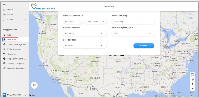
So different filters available are:
- Select Data source: Choose entity and its view to analyze data.
- Select Measure: Select the aggregation method to be used to color-code the region. By default, it would be based on a number of records.
- Select Filter: This option lets you select a category to filter data results.
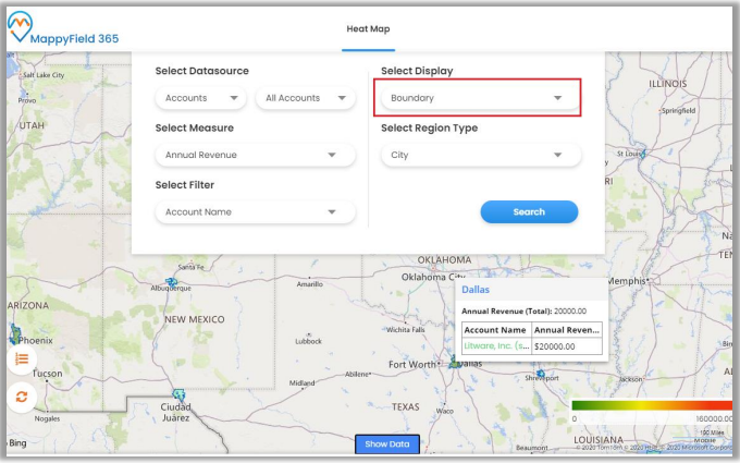
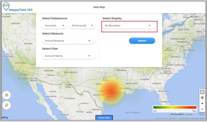
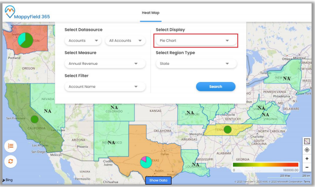
- Select Display: You get four different options to analyze data on the heat map. Options are:
- Boundary: This creates a heat map based on the selected region type.
- No Boundary: This option creates a heat map based on the density of the measure selected without geographical boundaries.
- Pie Chart: View data in form of pie charts based on attributes selected in measure & filter.
- Column Chart: View data in form of column charts based on attributes selected in measure and filter.
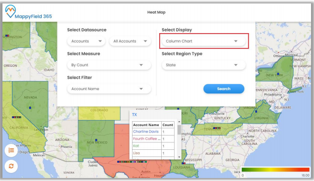
- Select Region Type: Define geography level of aggregation. It can be any from the city, state, country, and postal code.
Note: On hover, it shows details of the boundary, pie chart, or column chart attributes, and clicking on a specific highlighted region shows up the summarized information for the same.